")
From bankrupt to boutique, this is how Venezia FC became the most stylish team in European football.
All football clubs sell shirts. And they do so in a pretty recognisable formula; take the design template the club has used for hundreds of years, make a few minor tweaks, slap a far too big, horrible looking and morally questionable sponsor on the front, and then whack it on the club website at £80 a piece. Whilst that may sound like a complaint, they must be doing something right as, despite that, we all buy them every season, and we literally have a whole magazine dedicated to them.
But we also like clubs that break this mould – clubs that try something new and different, even if it doesn’t come off. Clubs with the creative bravery to risk upsetting the status quo template in pursuit of something that supersedes it to become its own footballing work of art. Clubs that don’t sell shirts, but instead sell fashion. Clubs like – Venezia.
Venezia didn’t just break the mould, they smashed it, picked it up, wiped it dry and Rory Delaped it into a box full of chaos. And here’s how:
Venezia are, of course, an Italian side based in Venice that currently play in Serie A. Originally founded as Venezia Foot Ball Club in 1907, they have spent a large part of their history in Italy’s top two divisions. Despite being a credible football team in their own right with plenty of history, they have become most known nowadays for their aesthetic, through shirts and other apparel releases.
The club were declared bankrupt in 2004, following the sale of the club by owner Maurizio Zamparini, who went on to buy Palermo. This led to Venezia having to be revived as a phoenix club three times since 2005.
However, in 2020, American businessman Duncan Niederauer took over the club, and decided to take I Leoni Alati (The Winged Lions) in a new direction. Venezia began a rebrand, focused on culture, fashion and global appeal. They decided to lean into the identity of Venice as a world renowned city for classical artwork, architecture and fashion. In an interview with Stadium Astro, Niederauer explained his decision: “If you’re in the city like Venice which is at the centre of art, fashion and history, I think it’s incumbent on us to do our best to have the club aligned with the virtues of the city and the strengths of the city.”
Part of this revamp was to transform the appearance of the club, most notably how the team looked on the pitch. From then on, Venezia started releasing some phenomenally good looking kits, and in Niederauer’s first year earned promotion to the Italian top flight for the first time in 19 years, almost as if the fashion ethos off the pitch reflected itself in classy play on it.
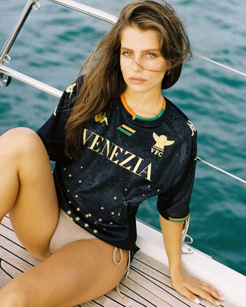
They released their first home shirt of this new era in the 2021/22 season, famously featuring Greek model Theopisti Pourliotopoulou in some, let’s say ‘interesting’, poses. That image in particular may seem a bit provocative and out there, but Venezia’s marketing strategy worked, with the release getting fans and media outlets across the world talking about the shirt. This, however, was of course helped by the fact that the shirt itself is drop dead gorgeous.
That shirt, manufactured by Kappa, broke new ground from the off by boasting a black textured background as the base, instead of the usual orange and green stripes; the texture being a beautiful motif of a printed trompe l’oeil Venetian wall. The gold detailing in the starry pattern, the Kappa logo and the totally revamped and designer fashion style badge, help to create the high-end look that the club were looking for. As the orange and green are used more subtly than usual, but are still the colours that represent the club, a tri-colour flag features in the upper centre of the shirt to ensure there is a still a nod to tradition. Rather than spoil a great shirt with a morally ambiguous and bad looking sponsor, the club opted to simply have ‘Venezia’ printed in gold, stylistic lettering to Kappa (cap) off the shirt. Unsurprisingly, it sold out within eight hours of its release.
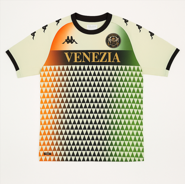
The away kit also followed suit, replacing the textured black background with a clean white one. Layered over that is a contemporary triangle pattern, with, instead of stripes, an orange, black and green gradient, which travels up the shirt. The theme is consistent with the home shirt, sticking with the gold ‘Venezia’ and the trim.
These releases represented a new era for not only Venezia, but for football kits as a whole. Kappa completely reframed the way in which shirts could be designed; despite still nodding to traditional elements of what Venezia kits have been in the past, they took the usual shirt template and totally reworked it into something that almost doesn’t look like a football shirt at all, but in the best possible way.
They have now continued this style after the success of these releases, especially the home shirt. Their 22/23 home shirt was similar but with a more contemporary minimalist approach, yet with a retro style collar; something which has been revived in football shirts over recent years. In fact, that year the high-end approach went even further, with the club releasing a completely gold third kit, featuring a black trim and collar.
The 23/24 home shirt opted for a vertical tri-colour stripe down the middle of the black based shirt, which I’m personally not a fan of, but it also boasts the addition of the words ‘Citta Di Venezia’ below the badge in gold writing, which looks extremely classy (a running theme). They also continued with the use of female models in their marketing for shirt releases, again to reinforce the stylish motif the club were aiming for to reflect the city of Venice.
This year’s home kit is similar, and you can read more about that here.
Venezia’s approach has been a success. By focusing on their Venetian identity, the club have drawn eyes from across the world, and their shirts have now been sold in boutique stores, appeared in fashion editorials (like ours) and have been worn by people to whom if you uttered the words ‘Serie A’ they’d think you meant the middle-east. The line between football shirts and pure fashion based jerseys had already been blurred, but Venezia were the first to completely boot right through it.
There is also a certain beauty to the fact that this was not something accomplished by a footballing titan like Madrid or Barcelona, but rather a small Italian side reborn from the ashes of bankruptcy to create something that transcends football and reframes what a football shirt actually is.
In doing so, Venezia proved that kits don’t have to be boring, templated, sponsor-drenched cash grabs. They can be art. They can be statements. They can be worn with pride by almost anyone, by people who don’t care about the score on Saturday, or promotion or relegation, or Trequartistas and Segundo Volantes; and maybe that’s their charm.
So while most clubs still just sell shirts, Venezia sells a dream. And it seems we’re all buying it.