")
After a prolific few seasons beginning in 2015 where the club gained promotion all the way from the National League to the mighty heights of League One, Lincoln City have become a mainstay in the league since 2019.
Lincoln have always had an iconic red and white striped look on the pitch, synonymous with the Lincoln Imp which features in the city’s world renowned cathedral. In this piece, we’ll take a look at the best iterations of the Lincoln look, as we rank the five best Imps shirts of all time.
5. 2020/21 Home Kit
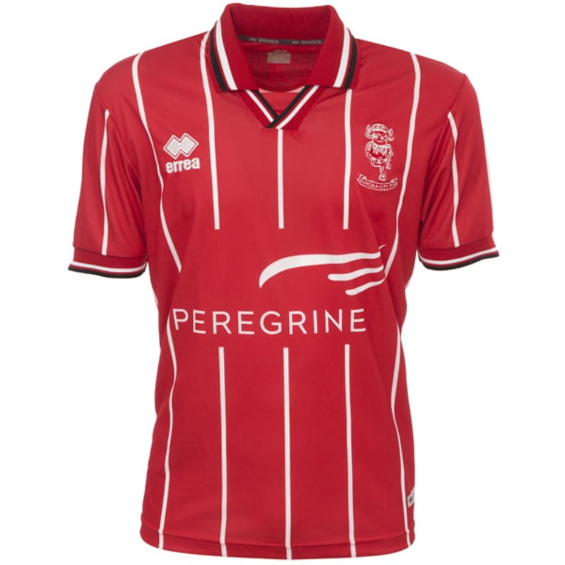
Positive memories will be taken from the 2020/21 season, as Lincoln made the League One playoff final; although you could argue agonising memories also exist after the final loss to Blackpool. As for the shirt, it’s a move away from the traditional red and white stripes in favour of a red base with white pinstripes. It makes for a nice change to the home strip, especially the way in which the lines are broken up by the sponsor (although the Peregrine is far too big).
The main strengths of this shirt lie in the collar and the sleeves, which have a lovely black and white trim, especially the way the white pinstripe bisects the horizontal lines on the collar. Whilst some didn’t like the move away from the traditional thicker stripes, the pinstripes look modern and clean here, breathing some new life into what a Lincoln shirt can be.
4. 2003/04 Home Kit
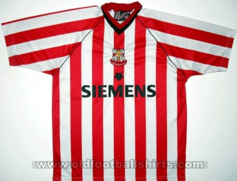
This one is all about the sponsor. Siemens has a major engineering and manufacturing presence in Lincoln, and is one of the city’s largest employers, making it a company that is deeply embedded in the community. This makes it a shirt that has a place in the hearts of many Lincoln fans, and gives it a local connection that feels like it represents the community it is made for.
The kit also features the classic red and white stripes, a staple, as well as a centralised badge which has made a comeback in kit designs nowadays. You could say its a bit simple, but it represents what a Lincoln City home shirt should be; not overcomplicated, but effective and with a hearty tie to the club’s community.
3. 2008/09 Third Kit
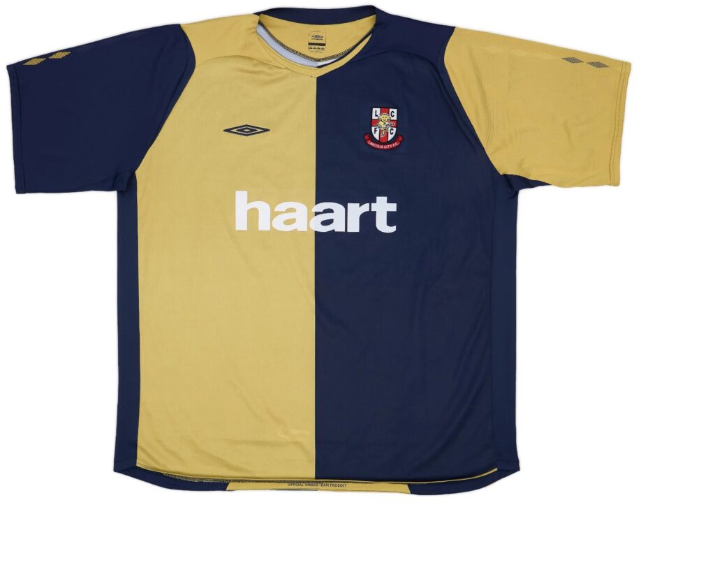
This Umbro number is a great example of what a third shirt should aim to achieve. In essence, it is a simple design but with a creative yet nuanced colour scheme. The gold half of the shirt is the perfect shade; not too shiny and flashy looking but still enough to give a royal effect, and the contrast to the navy is clean. The Haart sponsor is simple enough as to not overpower the shirt, and the old Lincoln City badge is a thing of beauty, looking historic whilst still featuring the all important Imp.
Third shirts should be able to experiment with different colours and designs, but not go too far as to completely alienate what a club traditionally is. Here, Umbro have achieved this fantastically.
2. 2023/24 Away Kit
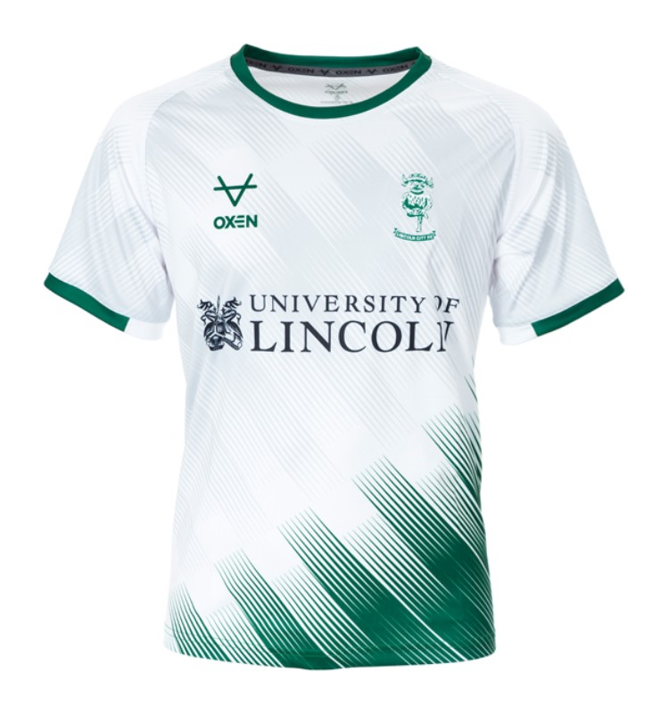
Lincoln have experimented with green away kits throughout their history. Their 1993/94 away kit featured an absolutely insane pixelated pattern in a turquoise green, and many away kits have opted for a dark green base colour, probably due to the feature of dark green on the Lincolnshire flag.
This is a different effort though, using white as the base colour and a green gradient pattern to detail the shirt, resulting in a very clean, modern look to the shirt that has detail but doesn’t overdo it. The pattern also continues in a light grey on the torso and sleeves, which is a subtle way to continue the pattern without overpowering the white. They also opted to use green for the manufacturer and the Lincoln badge to be in green, which suits the look as red would probably not have fit.
The University of Lincoln sponsor is one that obviously represents a pillar of the community, and ties together a fantastic away kit. Top marks from me.
1: 1999/00 Home Kit
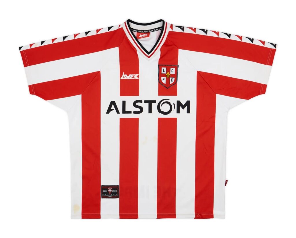
The angles! Something about the way the stripes are presented on this shirt is so pleasing to the eye. They are the perfect level of thickness and are spaced out so geometrically and symmetrically that it would make make the Taj Mahal blush. Even the way they are broken up by the Alstrom sponsor works perfectly and doesn’t ruin the cleanness of the design.
The shirt even compensates for the lack of the Imp on the old badge by featuring a black tag in the bottom left depicting the Imp, contrasting the white on the stripe it features on. Avec as a manufacturer is something different, and have smashed this one out of the park. They also provide the perfect final detail with their logo dotted down the sleeves, reminiscent of Kappa kits.
It represents the pinnacle of a Lincoln City home shirt, keeping it simple but effective and appealing to the traditions of the club in a design savvy manner. A real beauty.