")
The 2024/25 Premier League season has concluded and as per usual, much attention is now being turned towards clubs around the world releasing their new kits for next year.
The Premier League’s inception in 1992 meant that each club competing had to think more deeply into their kits’ style, due to the influx of televised games being broadcast to an audience of millions.
Since the 1992/93 season, well over 1000 different shirt designs have graced the Premier League. Plenty have been gorgeous but, of course, others not so:
1992/93
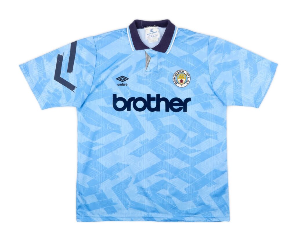
Best: Manchester City (Home)
The Citizens had the pleasure of wearing this kit in the season prior but there was clearly no need to alter their home style amidst the Premier League’s inception. A smarter strip, with the polo-esque collar and subtle wavy design pattern, twinned with the then soon-to-be iconic ‘brother’ sponsor gave the blue side of Manchester something else to smile about – as the sky blues finished the season in an impressive 9th place.
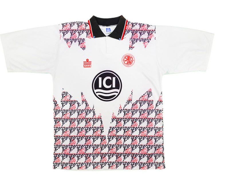
Worst: Middlesborough (Away)
It’s almost like they were asking to be relegated. This ambitious design looks as though somebody’s been given a plain white shirt for a Christmas present, which they gave up on unwrapping halfway through (probably as a result of disappointment).
1993/94
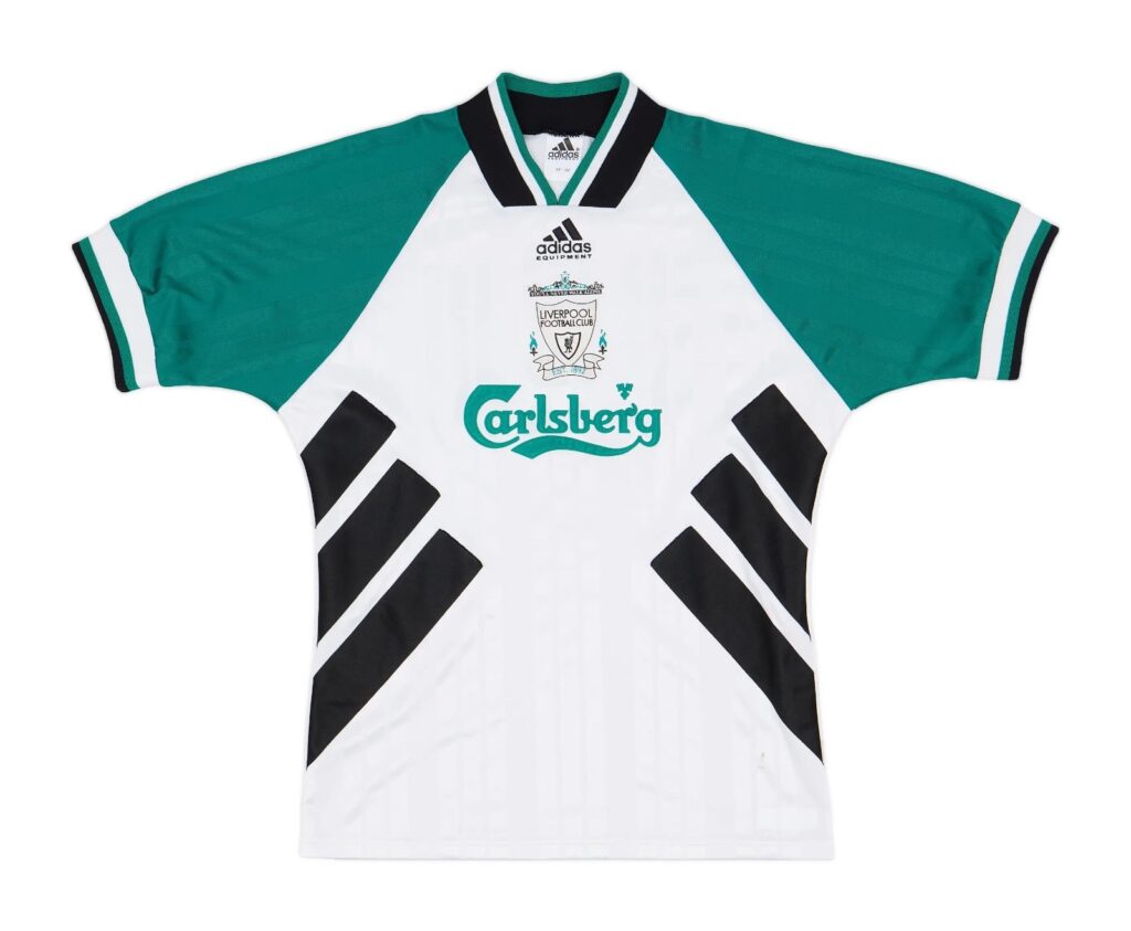
Best: Liverpool (Away)
You can’t blame Liverpool for reusing this design for the following season, a trend that plenty of clubs followed during the 90s. So many street fashion jackets have followed this design format. A clean, no nonsense approach with the club crest and sponsors falling down the middle embody the simplicity of the shirt. The turquoise accents are just lovely too.
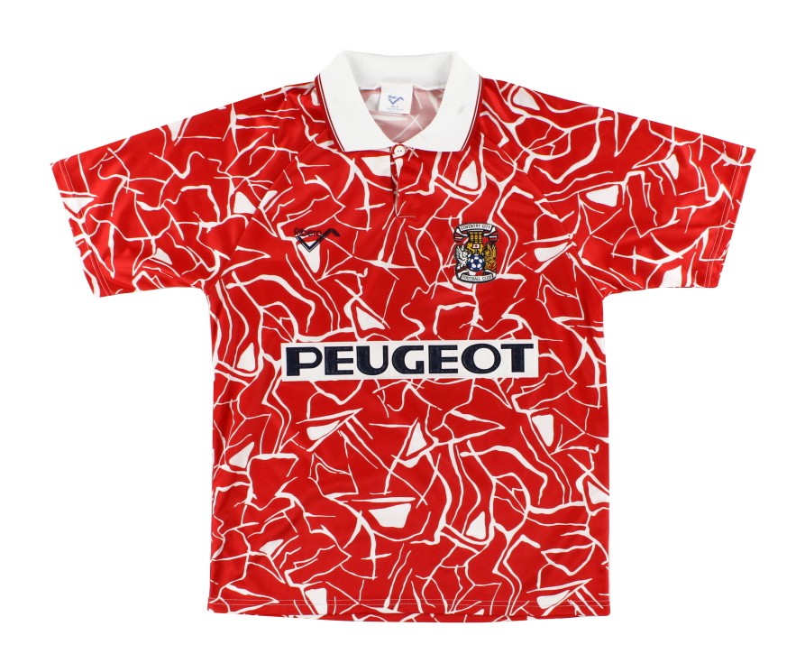
Worst: Coventry (Away)
This is a shirt for when kick off’s at 3pm, followed by a shift in an abattoir. Unfortunately for Coventry fans, this shirt bares some decent memories as they earned their joint best ever Premier League finish of 11th in 93/94.
1994/95
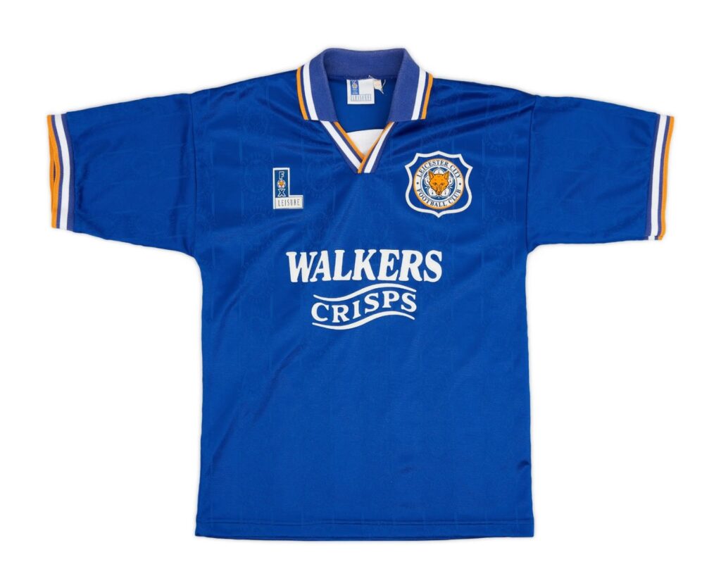
Best: Leicester City (Home)
Looking at the kit provide, you’ll notice that this was an in-house production via Fox Leisure. Again, another shirt with no messing about with consistency of the yellow and white accents on the collar and sleeve ends presenting a trait of fluid coherence on the shirt. This shirt also blessed Premier League fans with the Walkers crisps sponsor appearing in the new top flight, for the first time.
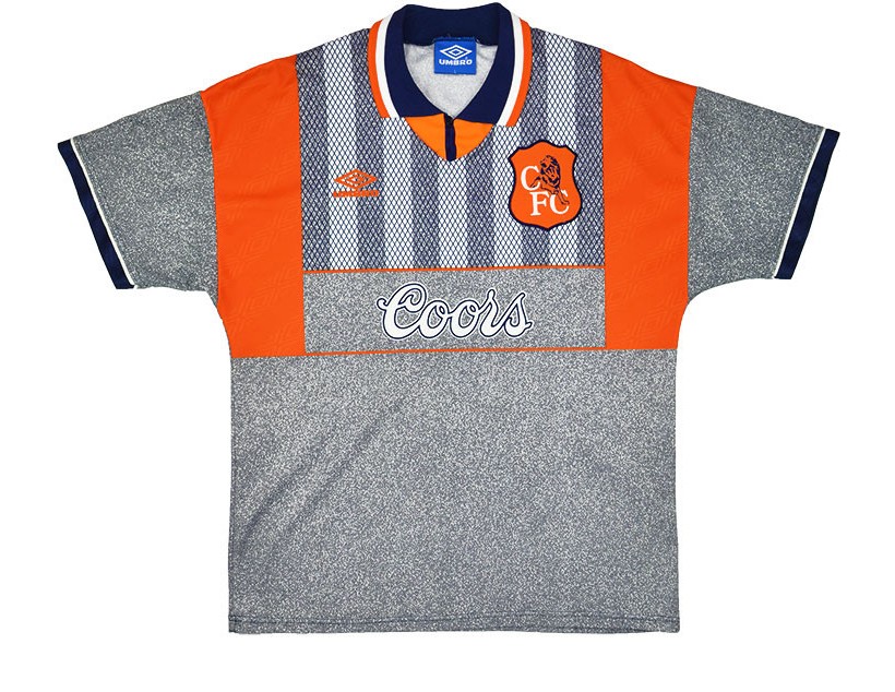
Worst: Chelsea (Away)
This just doesn’t look like a Chelsea shirt at all. Rather than representing anything football or club related, this shirt looks to more of a twist on a construction outfit. The orange wrapping over the shoulders mean that the shirt resembles a hi-vis jacket, with the grey elsewhere almost looking like concrete or gravel. It’s hideous, and the worst part is that they used it for the next season too!
1995/96
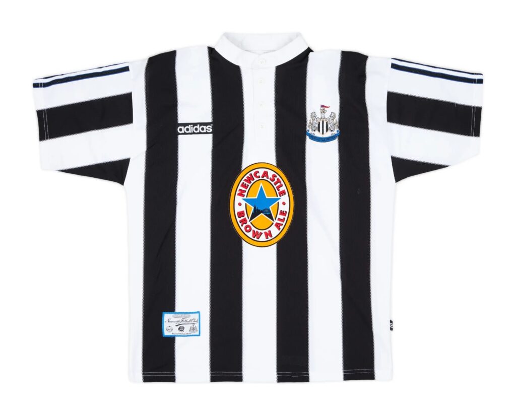
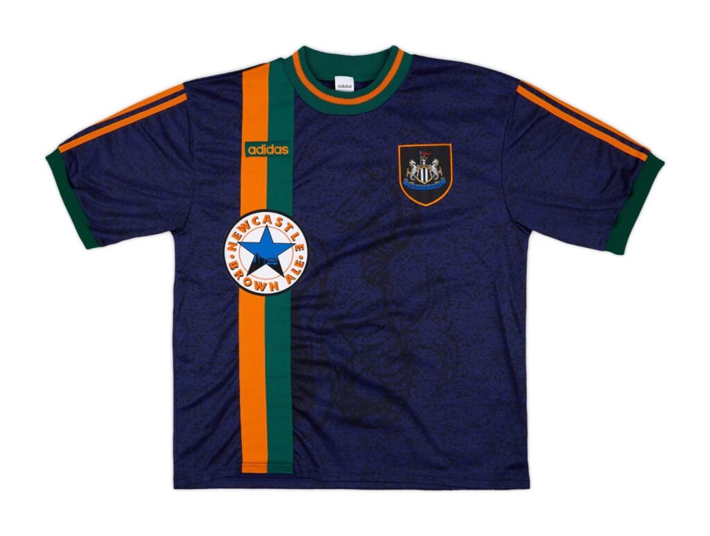
Best: Newcastle United (Home)
Is this the boring choice? Yes, but understandably so. This season was a pretty mundane year for top flight kits but Newcastle established one of the most iconic looks the league has ever seen with this strip. The full ‘Newkie Brown’ sponsor slap bang in the middle of the shirt has become a timeless staple of the Magpies, with this home kit earning legend status for its simplicity.
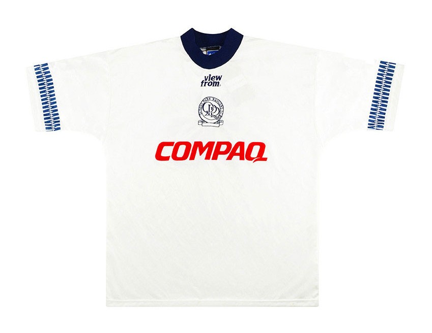
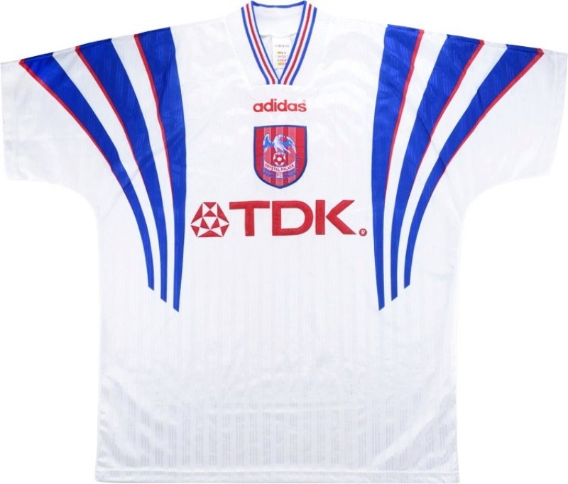
Worst: Queens Park Rangers (Third)
Here is how designing a simple football shirt can fall flat on its face, it begs the question ‘is that it?’ Yes, unfortunately it is. A close second to this strip was the infamous Manchester United away shirt, but at least that was memorable (albeit for all the wrong reasons). QPR were relegated this season with such outcome, twinned with this shirt, making it a campaign to forget for the R’s.
1996/97
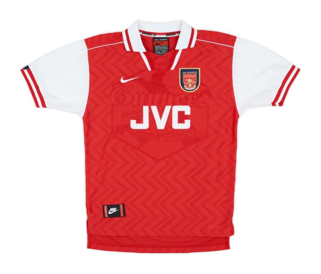
Best: Arsenal (Home)
Frankly, this was another dire season for stylish shirts. Umbro must’ve gone mad based off a lot of their designs, Nike less so though. It would be rude to write this article and not include a single JVC Arsenal shirt. From afar, this jersey looks simple but the background design close up is marvellous with its zig zags and bold ‘Gunners’ text.
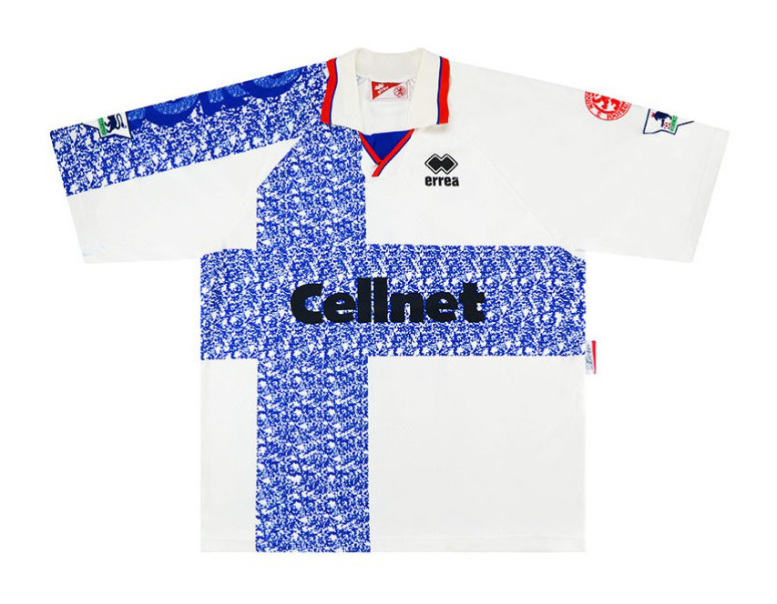
Worst: Middlesborough (Away)
Another Nort East howler here, why on earth is the club crest on the sleeve? If this were a Top Gear challenge, it would be “ambitious but rubbish”. The blue pattern could be perceived as a collaboration between Finland and the Weatherspoon’s plates, a true eyesore.
1997/98
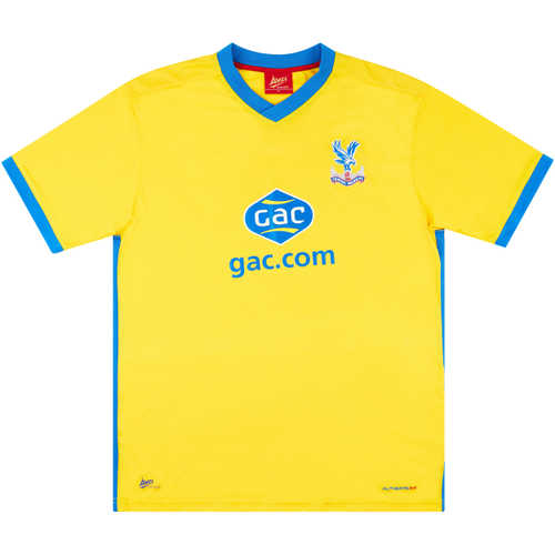
Best: Crystal Palace (Third)
Palace took their Eagles identity to another level with this shirt, with an evident influence from the USA national team’s kit design. This shirt is a prime example of how to design a strip with everything placed in the middle, making excellent use of the space around the shoulders into the upper torso area. The collar’s coherence with the rest of the shirt gives it a clean finish too.
Worst: Newcastle United (Away)
Okay, this shirt isn’t necessarily the utmost worst kit from this season – just look at Sheffield Wednesday’s away kit. It’s just hugely disappointing, given the consistency of high quality Newcastle shirts during this period. Despite encapsulating the Venezia look with the orange and green colour scheme, this shirt fails to follow the Italian club’s high standard of style with its wonkier look.
1998/99
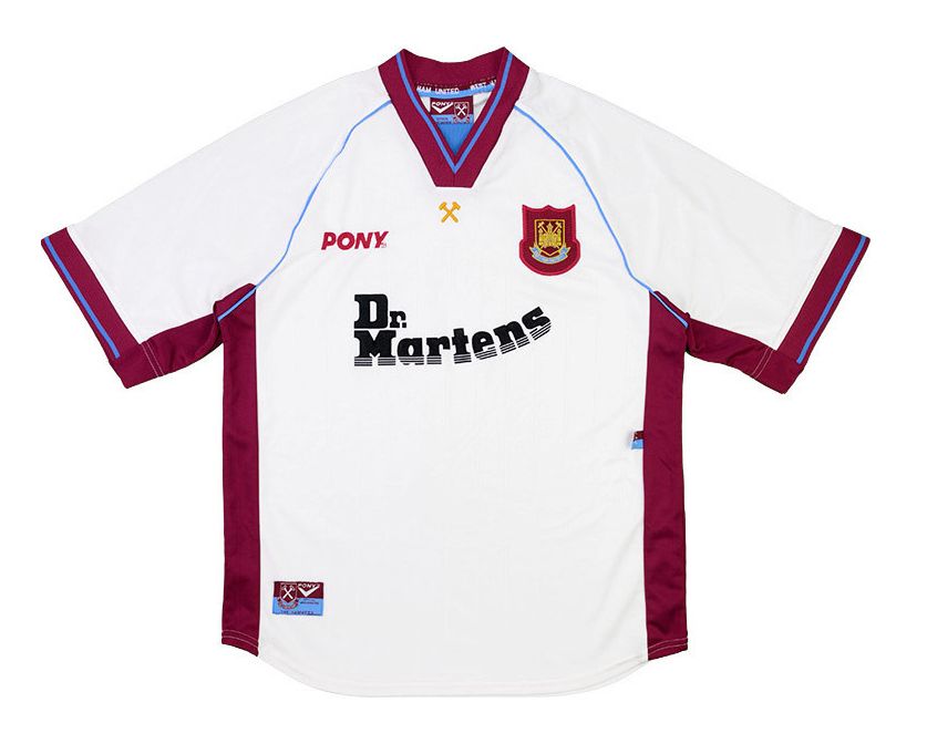
Best: West Ham United (Away)
The Irons’ began their iconic partnership with Dr. Martens this season, and the first group of shirts did not fall short. Pony as a name for kit provider by no means represents the shirt. The exaggerated crest and seamlessly clean usage of their trademark claret and blue around the shirt’s edges prompts salivation amongst Hammers fans.
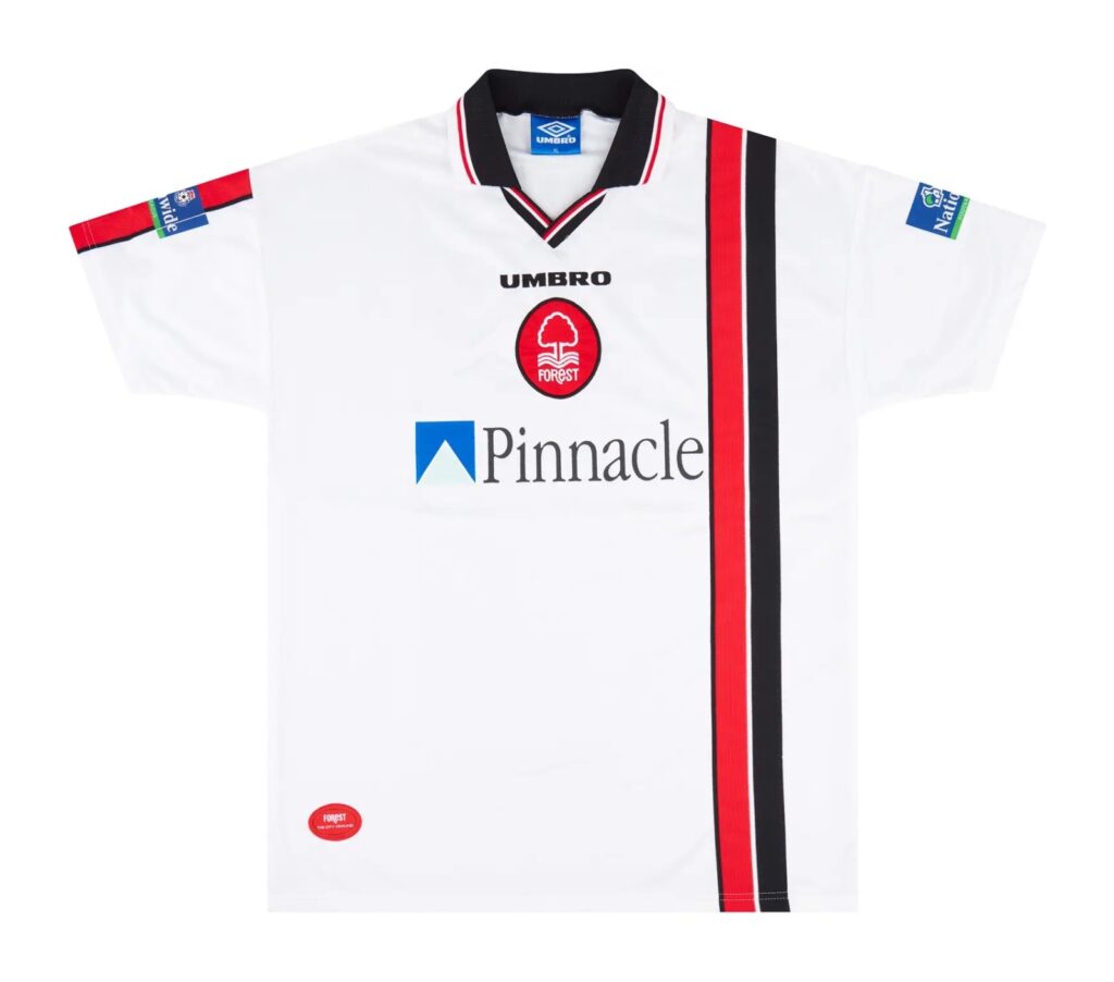
Worst: Nottingham Forest (Away)
On the surface, this isn’t a terrible shirt. However, only one of the sleeves has stripes going down it and it just looks incomplete. While the West Ham shirt was anything but ‘Pony’, this Forest shirt is definitely far from the ‘Pinnacle’ of kit design. Delving into the sponsors further, we see a bank and an insurance company – how riveting.
1999/2000
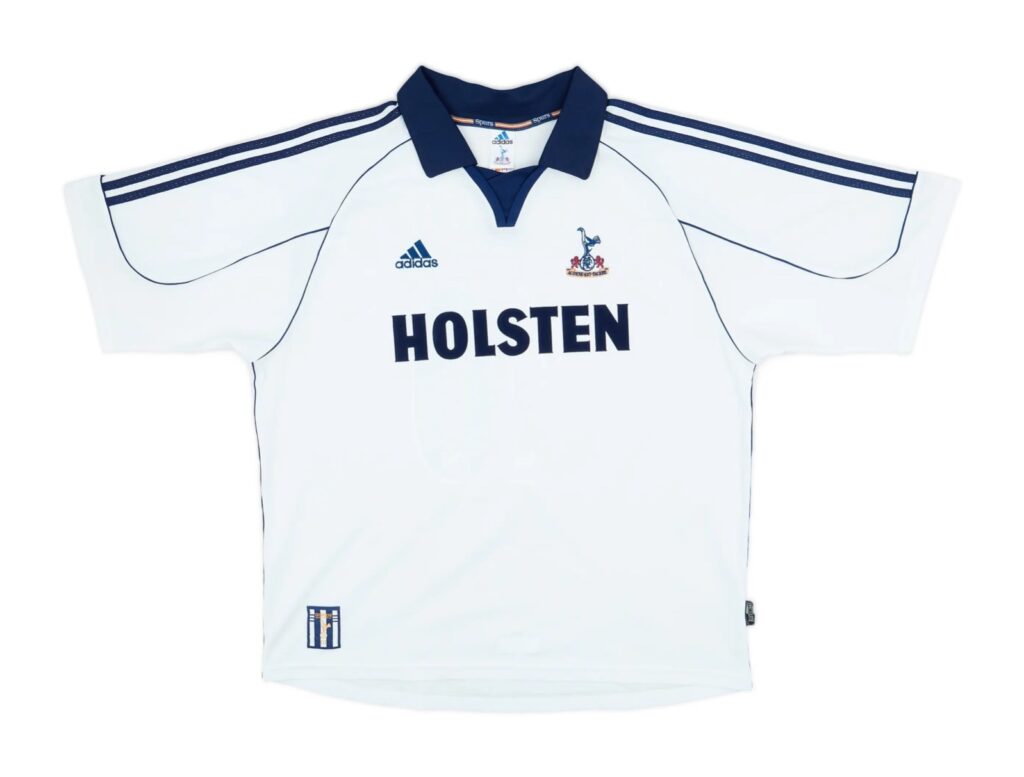
Best: Tottenham Hotspur (Home)
A much needed return to Adidas and Holsten ended a period of dreary kits for the Lily Whites, as the Premier League entered the turn of the century. The marauding collar and the bold Adidas sleeves stripe trios once again prove how simple can be effective, with the rest of the shirt hosting few features. It’s classy and well aged, with a recent influx in sightings of this shirt proving that.
Worst: Leeds United (Third)
Two collars, Jeremy? Two? That’s insane! It’s a shame because the rest of the shirt is far from terrible. However, in some cases collars can make or break a shirt and this kit is a prime example of the latter.
2000/01
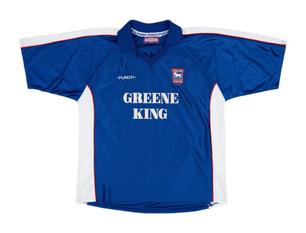
Best: Ipswich Town (Home)
To try and personify the shirt, it would be accurate to say that it would have a short back and sides haircut. This shirt is about as quintessentially ‘Barclays’ as they come, with such sentiment being largely embodied by the Greene King sponsor (none of that Ed Sheeran nonsense). Punch as a kit provider makes this strip a pretty rare piece too, as the small brand did an excellent job in, yet again, showing how simple is effective.
Worst: Manchester City (Away)
Here at PlayStyles, we love a long sleeved shirt. Sometimes though, extra sleevage is just not necessary. There’s an uncertainty as to whether this strip would be better suited for the moon, rather than Maine Road. Could this be the 116th charge?
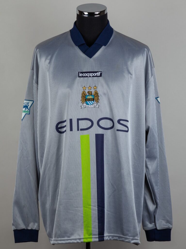
Graham Budd Auctions Ltd. via footballkitarchive.com
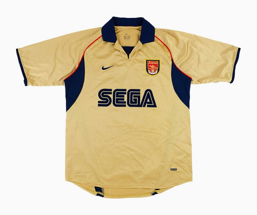
2001/02
Best: Arsenal (Away)
After releasing this kit, the Premier League season may as well have been called off. No club could drop a shirt like this and not become champions afterwards. Many Premier League clubs tried to pull off a gold shirt base during the 90s, with few being a triumphant effort and none coming close to this beauty.
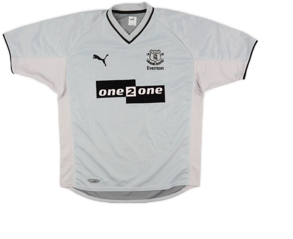
Worst: Everton (Away)
Yawns are provoked just from looking at this shirt. “It’s about as creative as a lobotomised Picasso.” – Harry Thursby, PlayStyles co-Founder.
2002/03
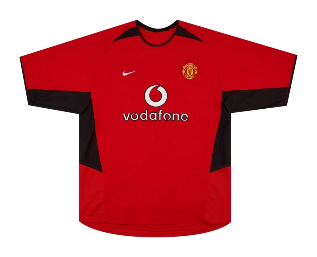
Best: Manchester United (Home)
It was only a matter of time before a Man United shirt got in the mix. This particular one has reached legend status amongst United fans, largely due to the huge names associated with it. The synonymity with Ruud van Nistelrooy likely wouldn’t have been possible if this shirt wasn’t so easy on the eye, the simple yet bold black accents and the varying print size mean that this shirt established itself as an early naughties football fashion statement.
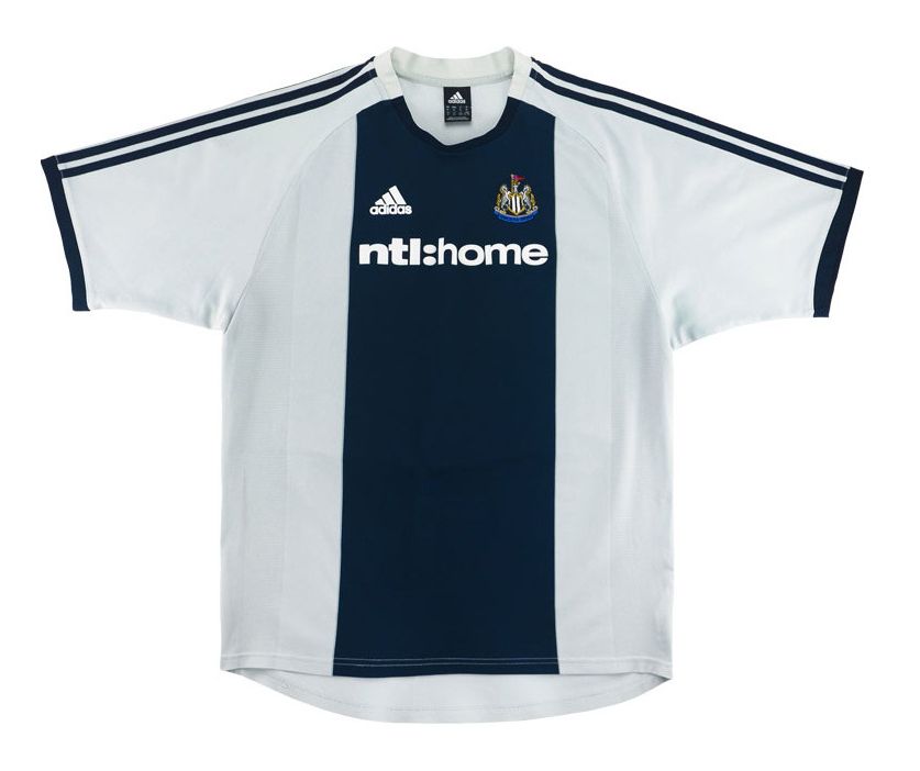
Worst: Newcastle United (Away)
No, that wasn’t a typo. This completely pointless shirt was somehow approved to be part of Newcastle’s away strip. The colour scheme is the exact same as the home shirt and it even has the audacity to have a few stripes – making the whole point of an away kit totally redundant. Other clubs’ away shirts from 02/03 like, Fulham and Southampton, didn’t stray too far from their home colours either, but enough inversion was made to be able to actually differentiate them. Lazy from the Toon.
2003/04
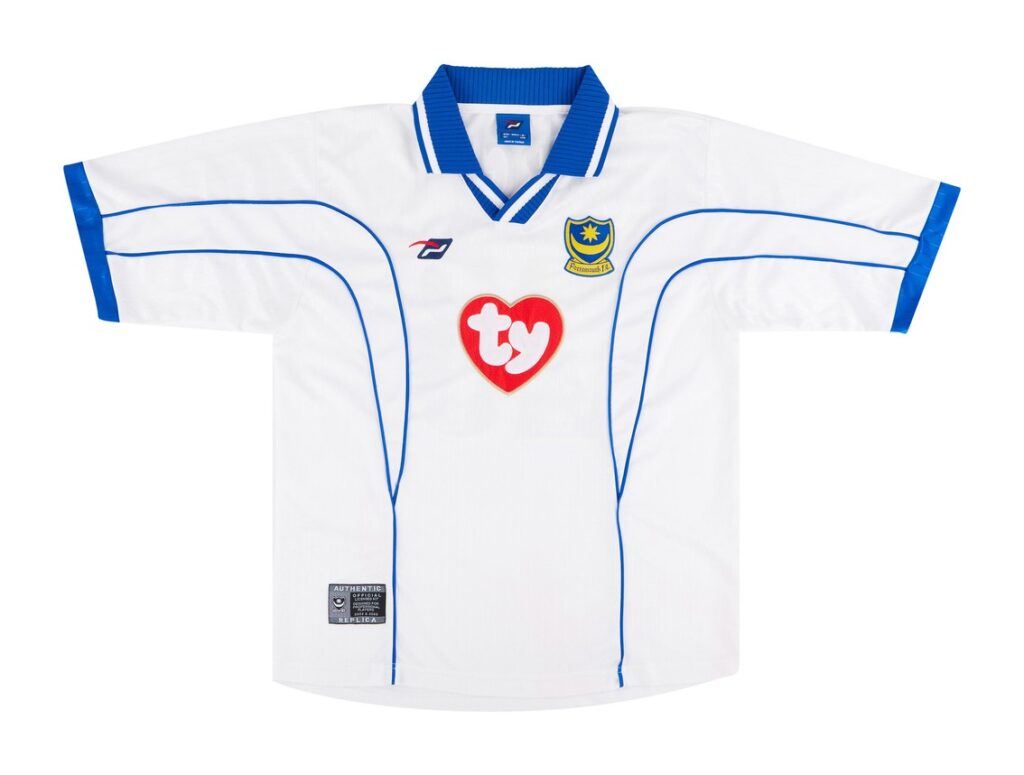
Best: Portsmouth (Third)
Portsmouth were newly promoted to the Premier League and boy did they want fans to know about it with this shirt. An inhouse production, gorgeous collar, subtly bold lines for detail and a front of shirt sponsor that cemented itself as a cult classic made a lovely polyester concoction.
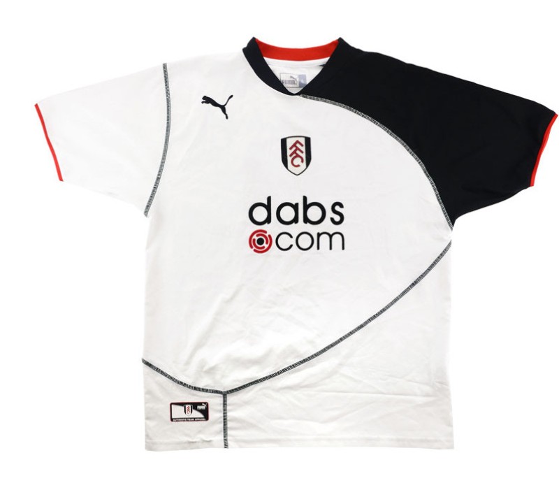
Worst: Fulham (Home)
Why Puma decided to be inspired by the most naff solar eclipse of all time is just beyond us. This shirt looks as though any player wearing it has a dislocated shoulder resting in a sling. It feels like a crime against football fashion that Louis Saha had to wear this shirt.
2004/05
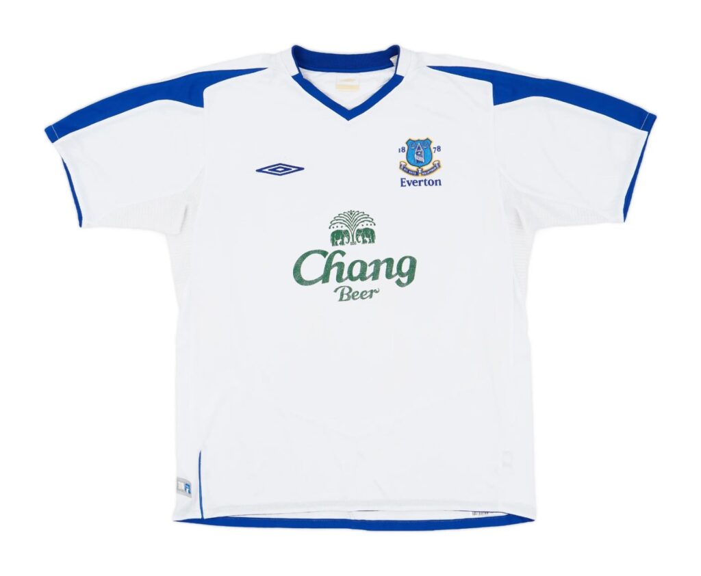
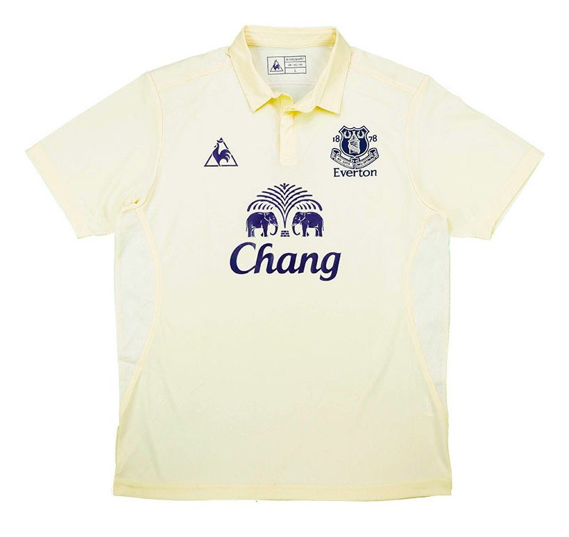
Best: Everton (Away)
As the saying goes, “if you cant beat ’em, join ’em.” Everton did exactly that by taking clear inspiration of white base Liverpool shirts of the past and even from this 04/05 season. The green beer logo against the white backdrop is a blatant copycat job and weirdly, we’re so here for it as the execution produced a clean, stylish shirt for the Toffees.
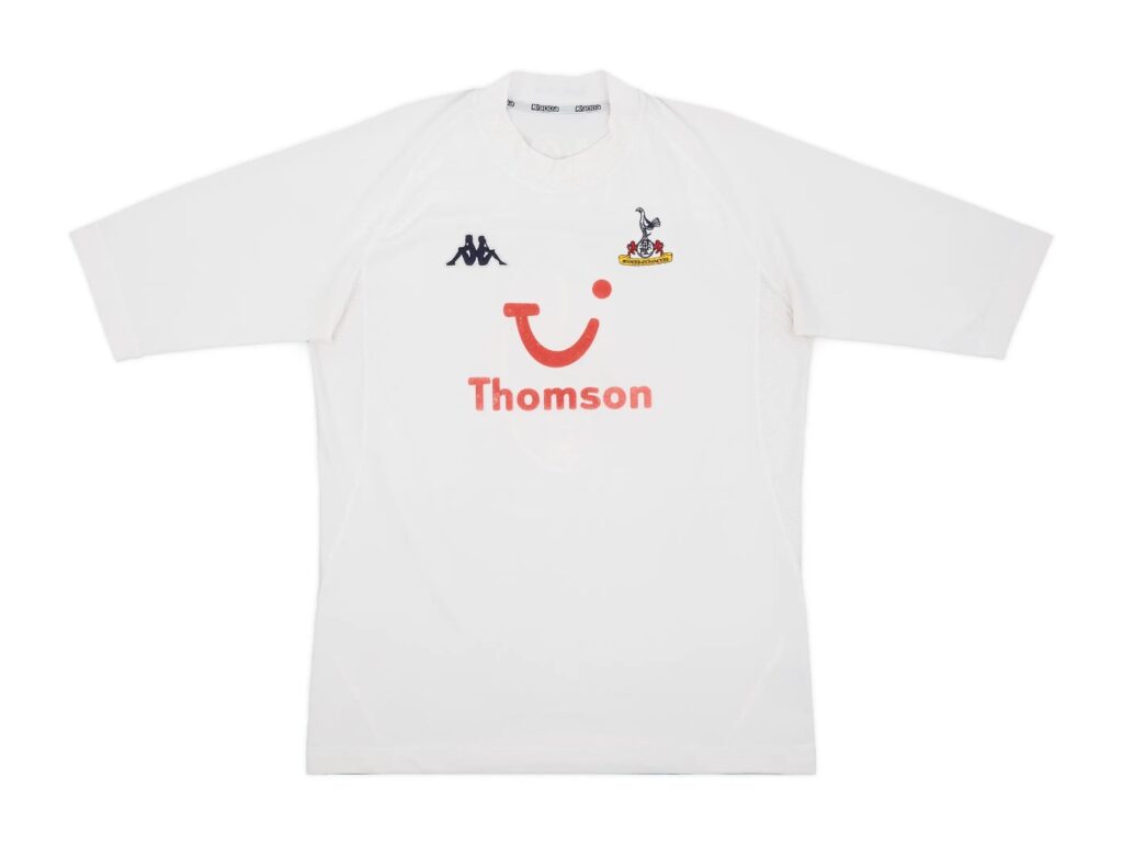
Worst: Tottenham Hotspur (Away)
Fakes shirts were beginning to truly circulate during the mid-naughties period, with this Spurs shirt being an imposter too. This strip more than likely takes the cake as the most boring Kappa shirt of all time, with the sleeves being left baron of their trademark funky logo pattern placement.
2005/06
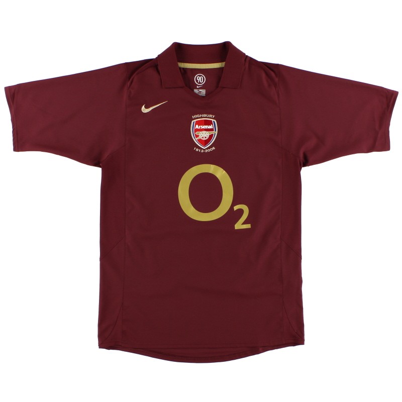
Best: Arsenal (Home)
Now this is how you say goodbye to a ground after playing there for almost a century. The redcurrant colour is just sublime and it pays homage to Arsenal’s older identity perfectly. It’s a shame Arsenal failed to life the Champions League trophy after making it to the final, this shirt deserved something special.
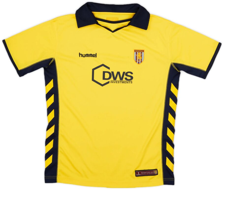
Worst: Aston Vila (Away)
To give credit where it’s due, this is a versatile shirt. It could be (reluctantly) worn by a footballer, referee, rugby player or an operator of JCB equipment. It has hazardous connotations and with good reason, as it’s probably best to avoid this shirt at all costs.
2006/07
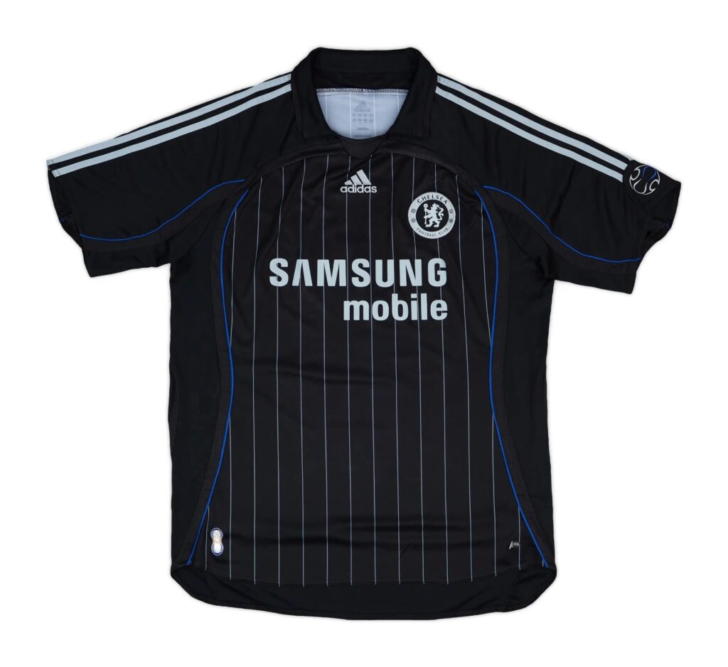
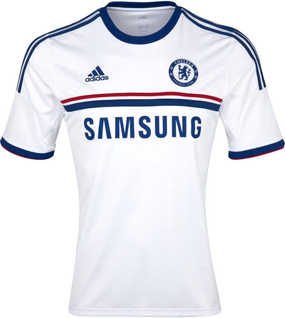
Best: Chelsea (Third)
A cold blooded shirt that manages to be so ahead of its time while also looking the part amongst other mid-naughties kits. The core of the shirt, with the stripes and Samsung logo, could deceive those into thinking that it was released 10 years in advance, blended with a bold stitching outline making the shirt look like so many boots of the time and even beyond.
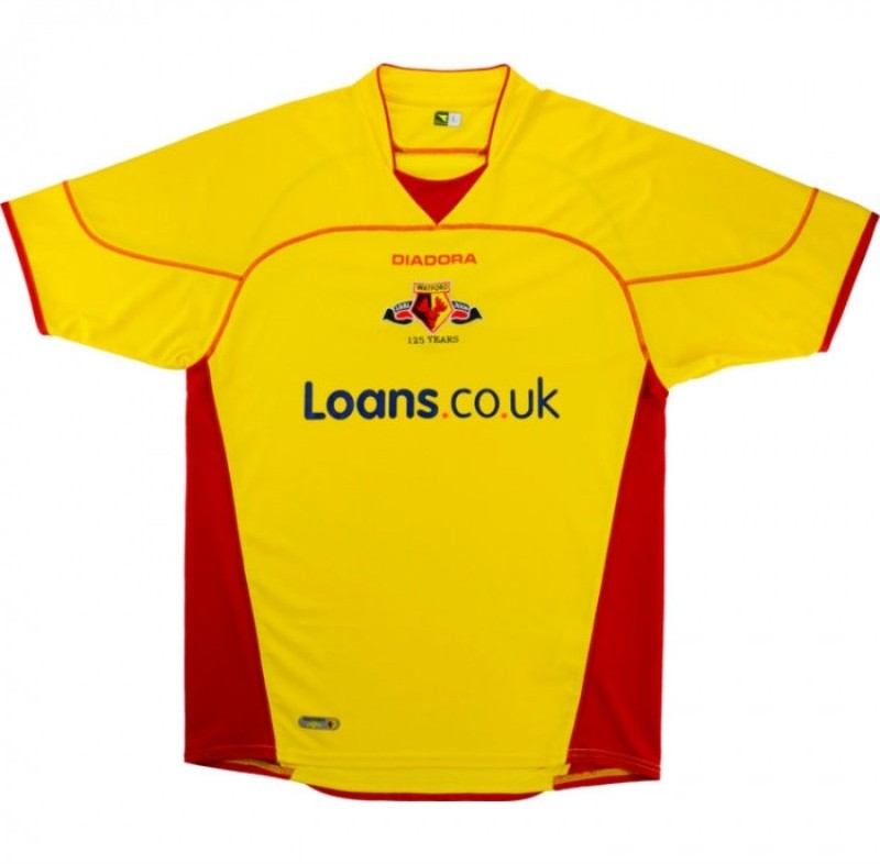
Worst: Watford (Home)
The Hornets turned 125 years old this season, and this is how they celebrate? It’s no shock that this was the last Diadora shirt seen in the Premier League as it looks better suited to being on a hotdog, rather than on a top flight footballer. Even the loans.co.uk font is a frustrating sight.
2007/08
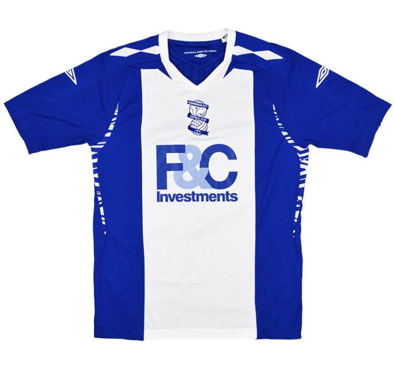
Best: Birmingham City (Home)
Umbro imposed this template upon a few Premier League clubs’ shirts for this season, with the execution of Birmingham’s iteration most definitely being the best. The pattern underneath the arm blends so smoothly into the side of the shirt with the string of shapes across the shoulder also adding a nice touch. The colours have been kept simple, allowing for a more creative approach towards the Brum kit, after years upon years of boring and forgettable shirts.
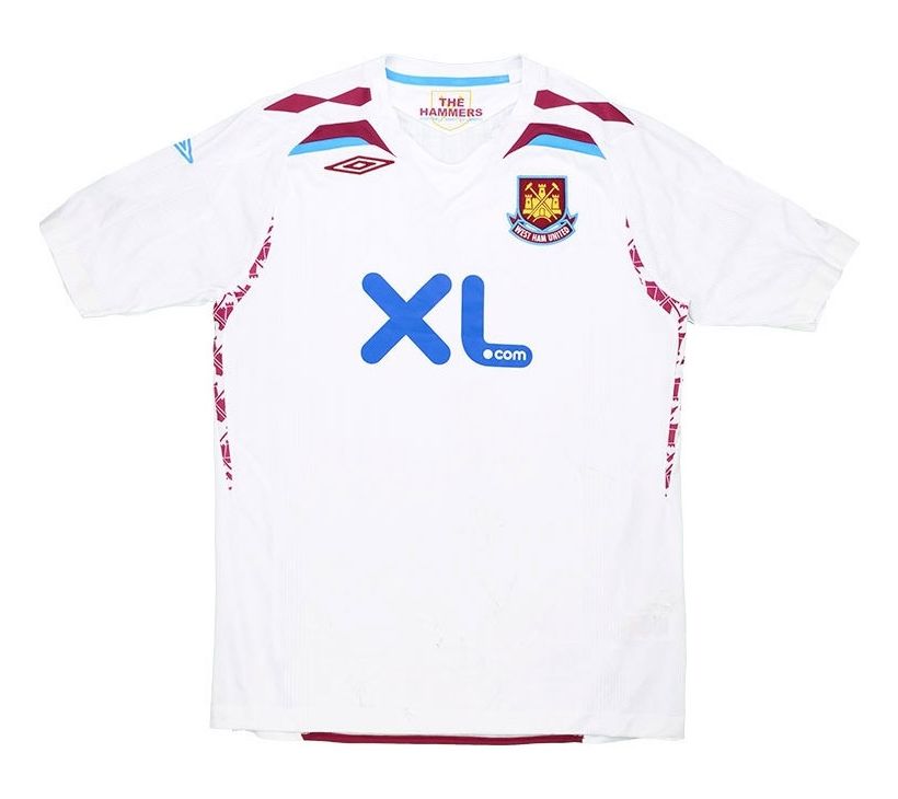
Worst: West Ham United (Away)
Look familiar? Well this is an example of how the previous Umbro template didn’t translate well to all the shirts allocated to it. Again, the patterns on the side are a nice touch but the goings on around the neck line just looks overcrowded – with the Umbro logo being placed uncomfortably high up. It doesn’t have a particularly flattering sponsor either.
2008/09
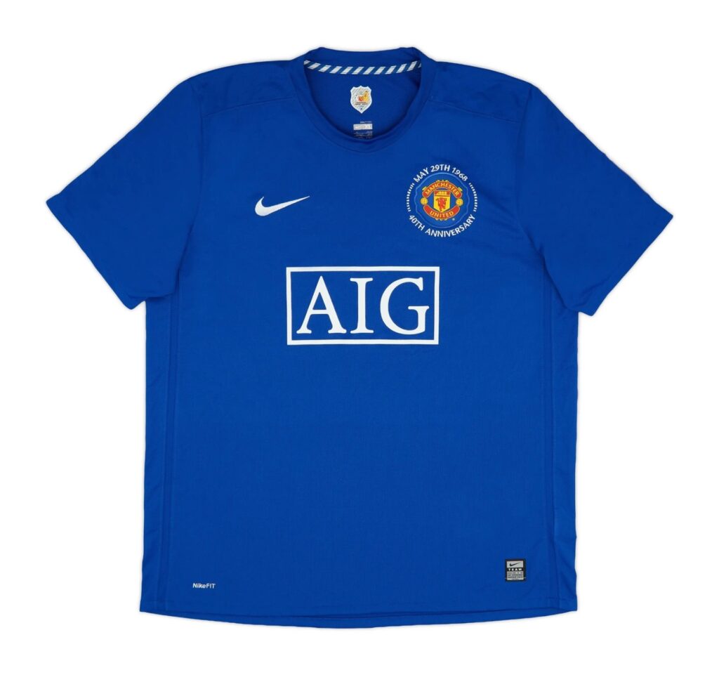
Best: Manchester United (Third)
Interestingly, one of the best Manchester United shirts of all time is in a rather out of character blue. This could be the king of simple yet effective shirts, with absolutely no messing about. It’s symmetrical and consistent within the context of printing size. The slightly darker blue colour itself is a pretty sight too.
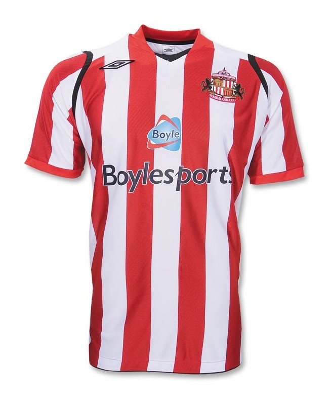
Worst: Sunderland (Home)
It appears that there must have been a landslide during the creation of this shirt. Once again, the Umbro logo finds itself in nosebleed territory and to cut to the chase, it looks ridiculous. Even the Black Cats’ crest finds itself further North than Sunderland itself and inexplicably, it’s visible from Mars. The rucksack-esque black straps around the armpit look appalling too.
2009/10
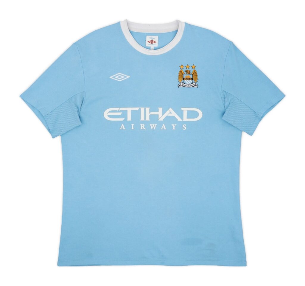
Best: Manchester City (Home)
Adopting a 1960s approach is rarely a good decision in any context. Exceptions include: treatment of the NHS, England’s strategy at a World Cup tournament and the design of this shirt. Route one earns the Sky Blues a number one spot for 09/10, with a strip that you could seemingly comfortably fall asleep in. The white collar is the most important factor, matching nicely with the sponsors and providing an excellent finishing touch to the jersey.
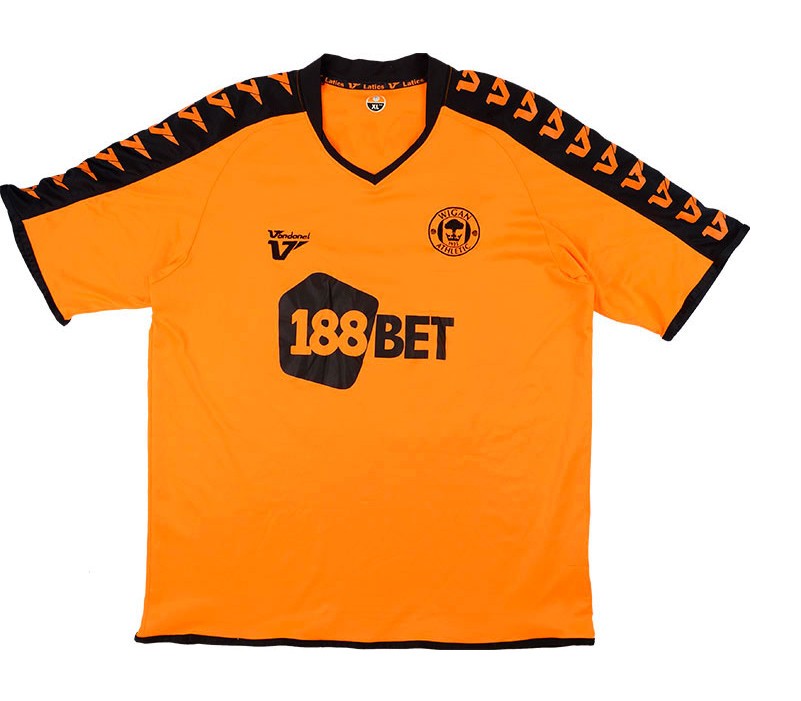
Worst: Wigan Athletic (Away)
There’s no way that this is a Premier League shirt, it just can’t be. What’s saddening about it is that the betting sponsor is somehow the most aesthetically pleasing trait of this shirt. Surprisingly, Duracell never attempted to sue Dave Whelan’s Tics over this shirt, they must have already felt bad enough by sympathising with the players for having to wear it.
2010/11
Best: Arsenal (Home)
This season, truthfully, could be considered a crime against football fashion. The standard of shirts is on the floor, hence why this shirt which looks like any other Arsenal shirt during this period takes the cake as it’s actually a nice jersey. The sleeves are probably its best feature as they’re similar to that of a trendy baseball jacket. No overcomplications, no problems.
Worst: Everton (Third)
It was a toss up between this and the Toffees’ away strip. It wouldn’t be a shock if Le Coq Sportif collaborated with the band 10cc, as whoever was responsible for the design clearly did not like cricket… they loved it.
2011/12
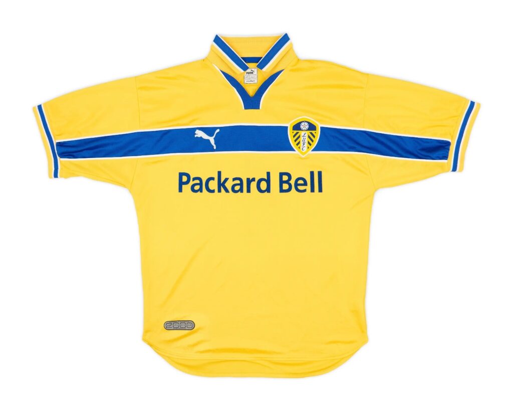
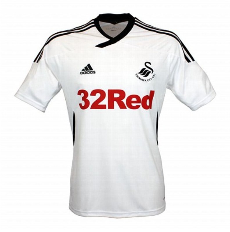
Best: Swansea City (Home)
Again, this period of the Premier League was dire in a football fashion context. Newcomers Swansea though, gave their fans a timeless home shirt that really wouldn’t have looked out of place in any season across the decade. The discrete features, such as the slightly overextended collar and the lines on the side, transformed what would’ve been another plain white football shirt into something a little smarter.
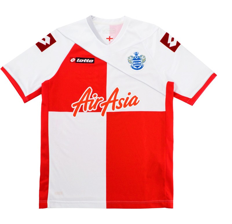
Worst: Queens Park Rangers (Third)
It’s pleasing to know that Joey Barton encountered the misfortune of having to wear this horrible thing. The lazily folded tea towel look is flat out hideous. No wonder Adel Taarabt thought that he was above the club when they were providing kits like this. This shirt mirrors the crazy environment at QPR during this time.
2012/13
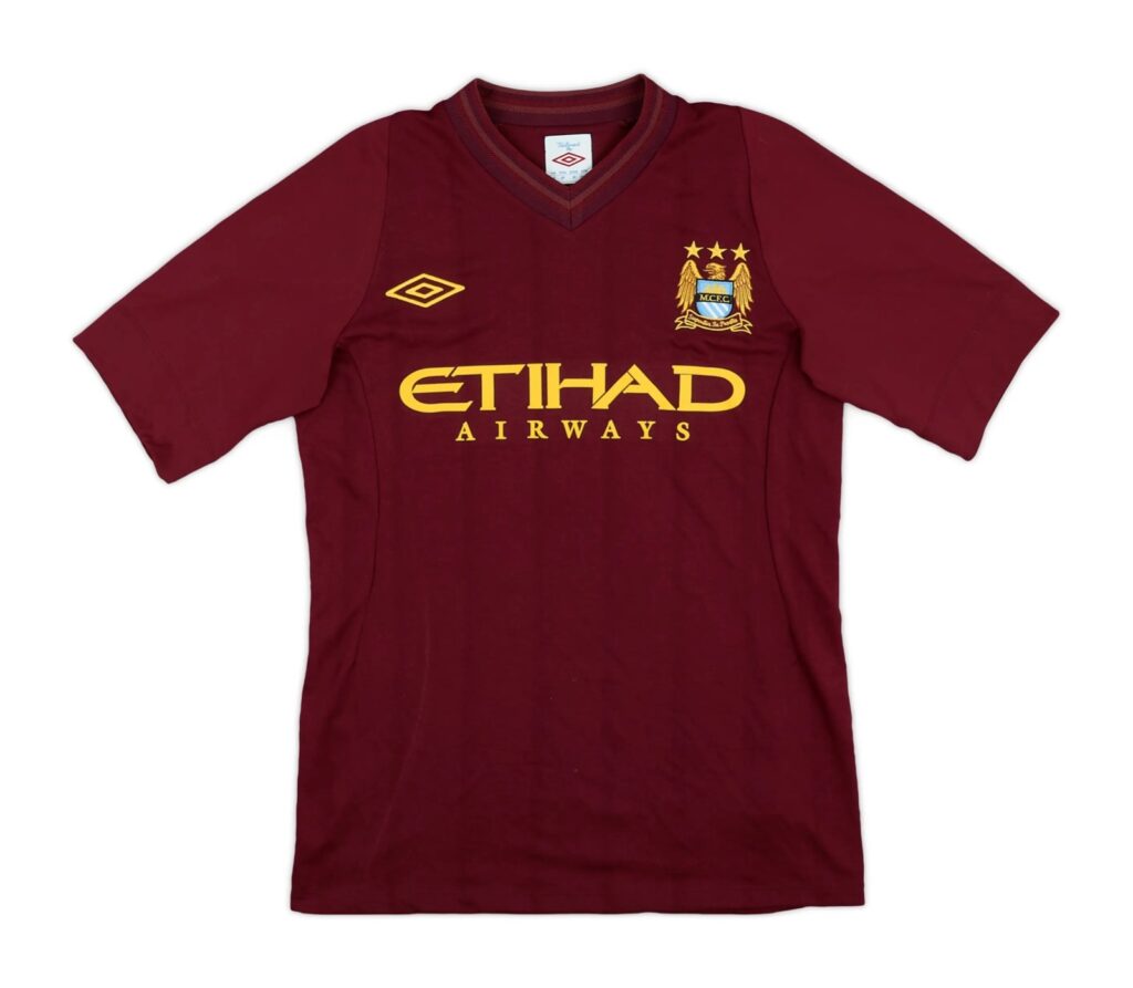
Best: Manchester City (Away)
For the sake of consistency throughout this article, it would be unfair to not include this Man City shirt. It’s strongly reminiscent of the redcurrant Arsenal shirt of yesteryear but with its own unique aspects, like the multi-layered collar. The gold accents of the shirt make it incredibly eye-catching.
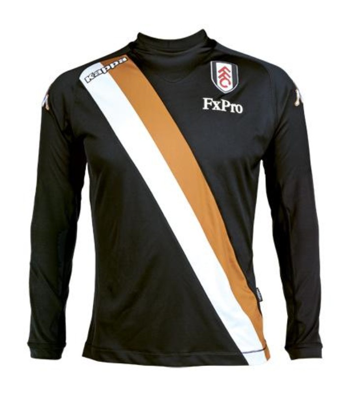
Worst: Fulham (Third)
PlayStyles champion ourselves as a brand with integrity, by not swearing in our pieces unless we’re quoting somebody. To follow that standard when describing this shirt was near-impossible. Instead, there are just no suitable words to explain this purpose-less abomination.
2013/14
Best: Chelsea (Away)
There have been plenty of iconic Chelsea shirts throughout the club’s history, this one goes a little under the radar though. It would be easy to confuse Adidas as the kit provider with somebody more style focused like Fila or Tommy Hilfiger, largely because of the striped across the chest. The decision to cut the sleeve stripes short is effective too, avoiding a tackier look.
Worst: Crystal Palace (Away)
A pair of crocs has more soul than this sorry excuse for a football shirt. It’s a design so feckless that Avec, the kit provider, didn’t even bother to stick their logo on it.
2014/15
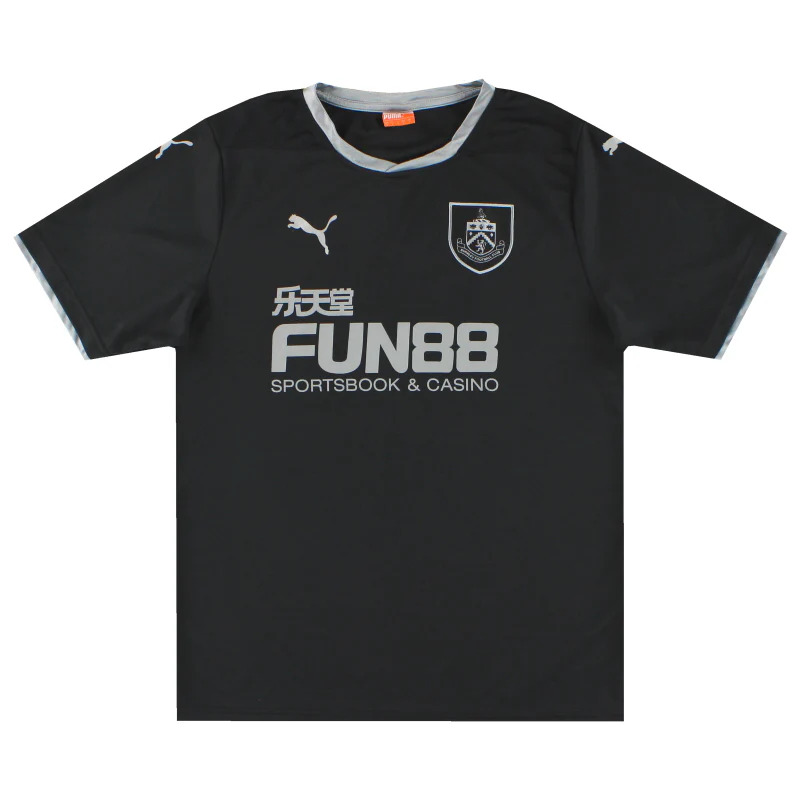
Best: Burnley (Away)
Did anyone expect newly promoted Burnley of all clubs to make as intimidating a kit as this? Unlikely. That didn’t stop the club from being relegated though. As proven by earlier shirts in this article, incorporating silver into a football shirt is a risk. Thankfully for Burnley though, Puma channelled the front of shirt sponsor and the gamble paid off nicely.
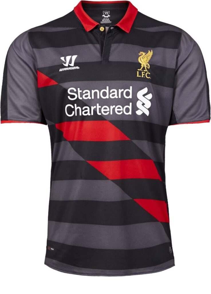
Worst: Liverpool (Third)
PlayStyles asked a Scouser to describe this shirt in one short sentence: “Pass the parcel, lad.” they said. The sash is just pointless and frankly infuriating. Liverpool’s era of shirts provided by Warrior was a chapter of the club’s history that has been quickly swept under the carpet, with this shirt contributing towards that.
2015/16
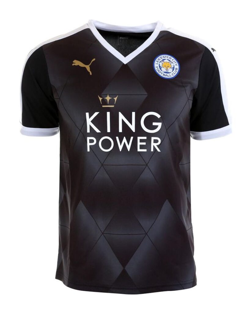
Best: Leicester City (Away)
In this instance, it would simply not be right to not include a shirt worn by the greatest underdogs in Premier League history. Besides, this is actually a lovely away kit with its diamond patterns and occasional gold accents. The triangular collar offers something a little different, as did their title winning triumph.
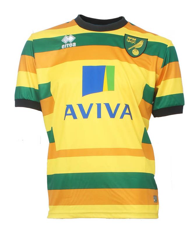
Worst: Norwich City (Third)
The Canaries came under a lot of scrutiny for reusing the same colours for all three of their outfield kits. Why they did this, nobody knows – especially when you take this appalling third shirt into consideration. The third kit should really have the most outside of the box shirt, which this definitely is but in the furthest way from good.
2016/17
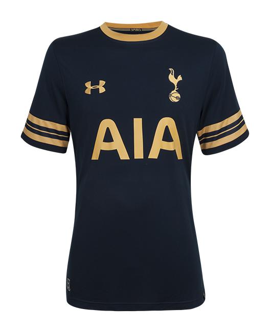
Best: Tottenham Hotspur (Away)
There was no right or reason for Spurs to produce a strip fit for champions but they did it anyway, despite being trophyless for 8 years by this point. Sam Sparro could’ve had this in mind when he released Back and Gold just months after Spurs’ League Cup trophy win. Those sleeve ends are just phenomenal.
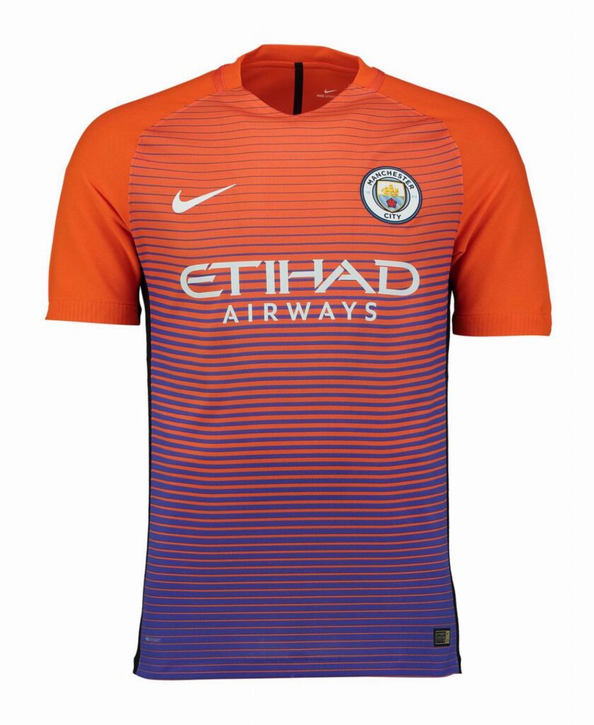
Worst: Manchester City (Third)
If we’re sticking to music for 15/16, Johnny Marr may have been the inspiration for this vomit inducing jersey: And if a Double Decker bar… with an execution as depressing as Morrissey himself.
2017/18
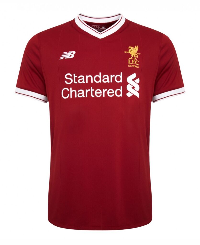
Best: Liverpool (Home)
Mo Salah’s arrival in Merseyside met the Egyptian winger with a beautiful home shirt that was head and shoulders above that of the Reds’ away and third kits. The consistency with the collar and the sleeve cuffs embody the shirt’s simplicity. Gone are the days of Warrior’s heinous attempts of shirt design.
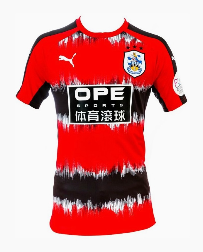
Worst: Huddersfield Town (Third)
“This is the worst shirt I’ve seen on this list, it annoys me to an extent where it upset me that they didn’t go down that season.” A quote from Ed Stansfield – PlayStyles co-Founder.
2018/19
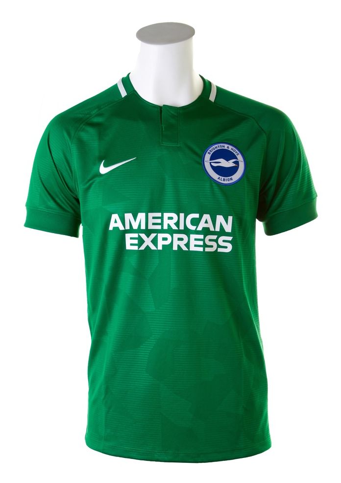
Best: Brighton (Away)
A cheeky green number for Brighton led to a kit with Irish connotations, disguised by an almost camouflage pattern base. As such, they channelled the good fortune of a four leaf clover by narrowly avoiding relegation from the league by just 2 points. This emerald colour is very easy on the eye, unlike watching Glenn Murray up front.
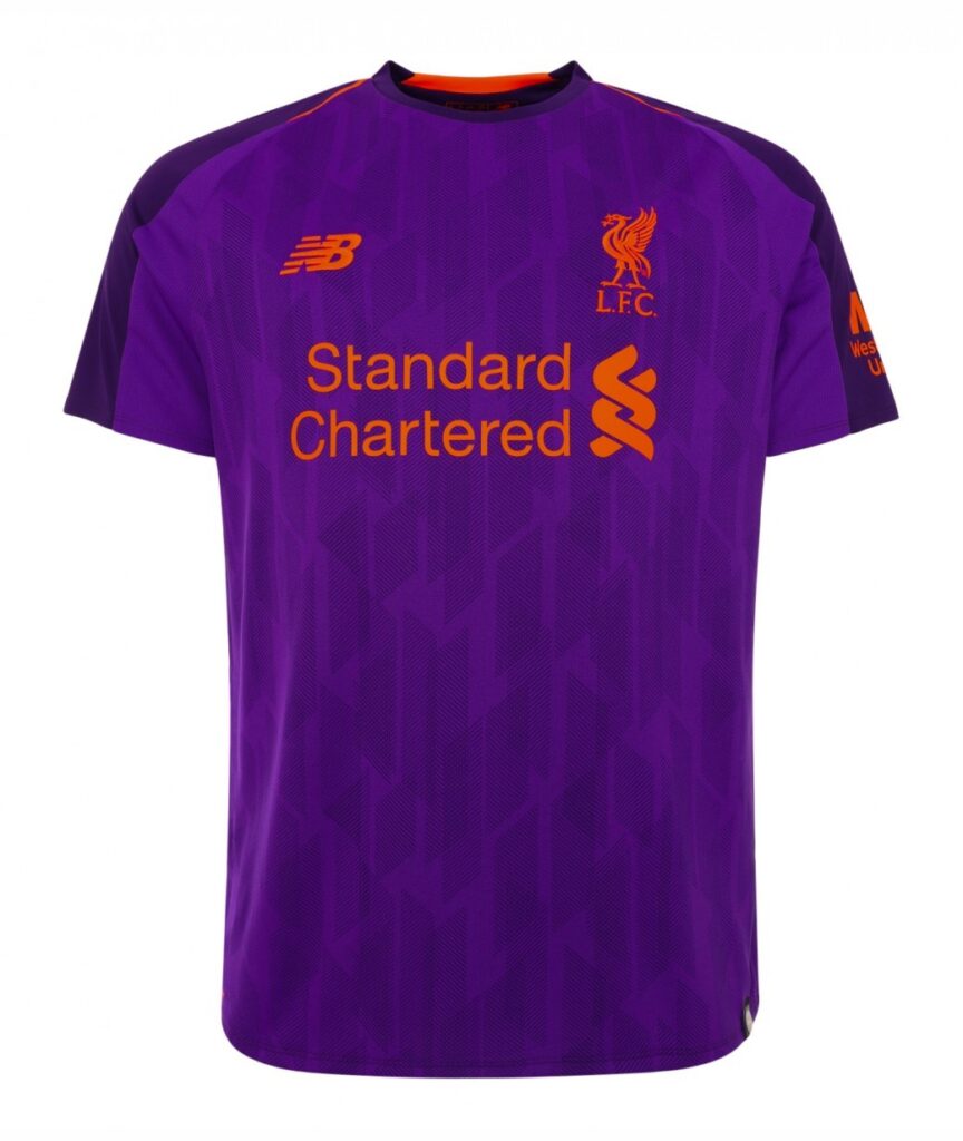
Worst: Liverpool (Away)
Anyone fancy a Twirl orange flavour? Unfortunately, New Balance did in 2018 prompting a catastrophic fall from grace from their home kit worn the year prior.
2019/20
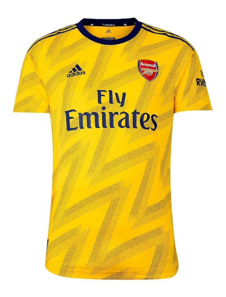
Best: Arsenal (Away)
If it ain’t broke, don’t fix it. The Gunners returned to their notorious ‘bruised banana‘ design, a shirt concept so good they couldn’t even wait for the 30th anniversary of its first usage 2 years later. The lockdown era was one to forget for Arsenal but this modern take on a classic, with the diagonal stripes and simplified collar, gave some of the older Gooners something to smile about.
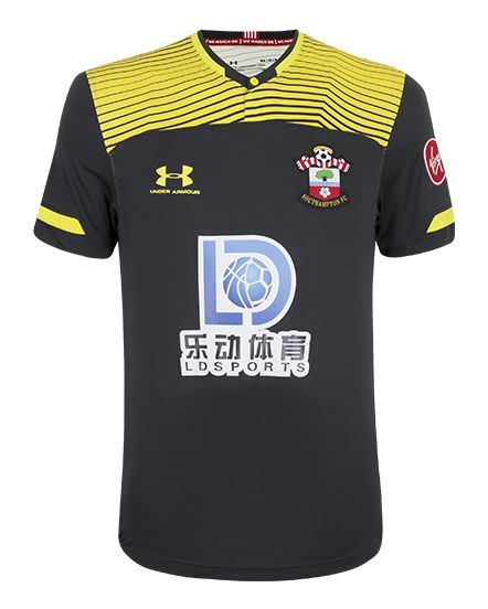
Worst: Southampton (Away)
A public prostate exam would be more pleasant than wearing this rag outside the house. “I’ll have a 2 on the back and sides and a Watford on top please, mate.” That so called “sponsor” too, just terrible. Under Armour must repent their sins to the Saints after coming up with this shirt.
2020/21
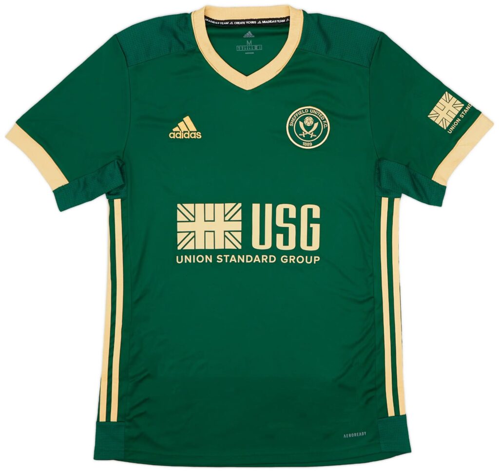
Best: Sheffield United (Third)
After a ridiculously impressive return to the Premier League, the Blades’ missed out on European football but instead were treated by Adidas with a sharp, elegant third kit. The racing green base colour, partnered with the Union Standard Group sponsor, devised a shirt that could find success at the Pride of Britain awards. The sandy accents collaborate nicely, with the V-neck collar falling near seamlessly on to the top of the shirt.
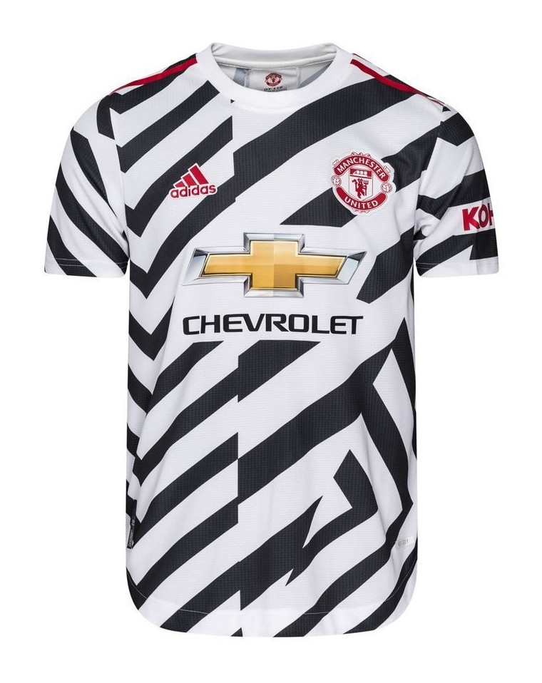
Worst: Manchester United (Third)
Somehow, this is a marmite shirt due to the fact that an overwhelming number of Streford Enders hold it in a high regard. The design is as about as coherent as Peter Beardsley’s attempt at the ‘World In Motion’ rap. It’ impossible to tell where the pattern starts/ends, with the Chevrolet logo plonked in the centre provoking further retinal damage.
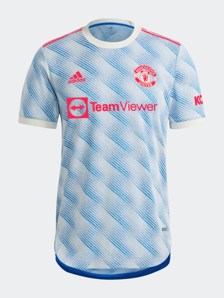
2021/22
Best: Manchester United (Away)
Now this is how a club redeems itself after a terrible zebra kit. This away shirt was based off the iconic Class of ’92 strip, with an ice cool modern twist similar to Arsenal’s bruised banana redesign, fit for the return of Ronaldo. Recycling old shirt designs is something we’ve covered on PlayStyles, you can read about it here.
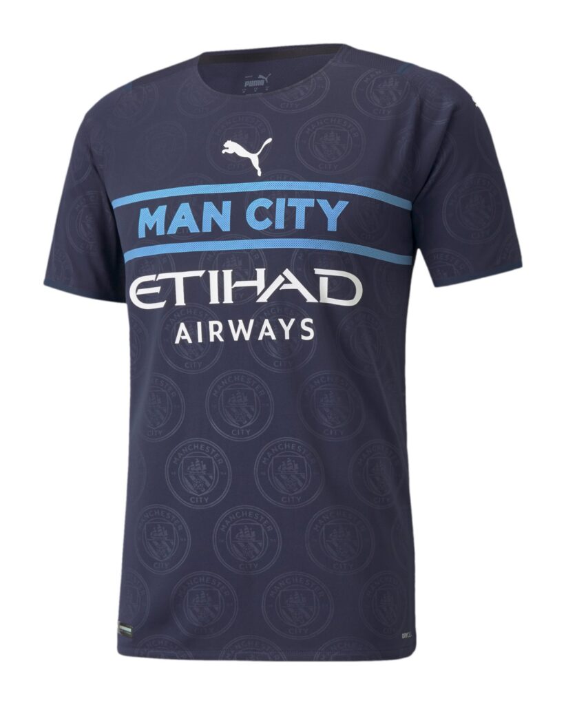
Worst: Manchester City (Third)
Just click here
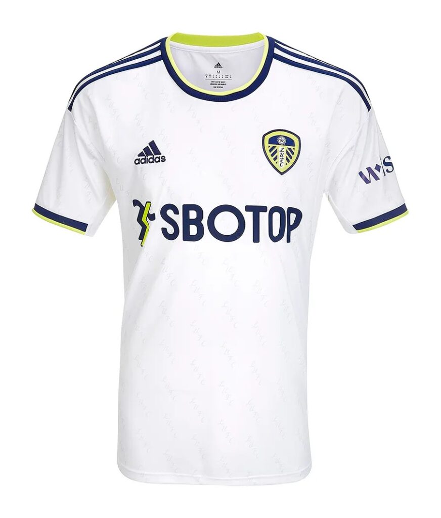
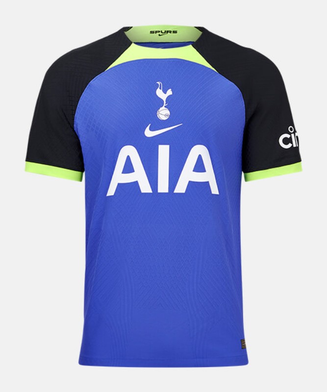
2022/23
Best: Leeds United (Home)
In truth, the Man City home shirt (and a couple of others) blow this shirt out the water – but for the sake of variety, this shirt was chosen. An honourable mention for the best shirt of the 22/23 Premier League season is Southampton’s away kit, as they tried something different and they would’ve pulled off a beauty if it wasn’t for the hideous sponsor. This Leeds shirt is clean, bold and it maintains consistency of the colour accents. The subtle LUFC pattern in the retro font is divine too.
Worst: Tottenham Hotspur (Away)
Poor Gareth Bale. The prodigal son returned to North London and was forced to wear what should’ve been a training top. Keeping everything in the middle is a formula that has worked brilliantly for many shirts in the past, but not this one. Despite the flashy colours, it’s somehow an overwhelmingly boring shirt.
2023/24
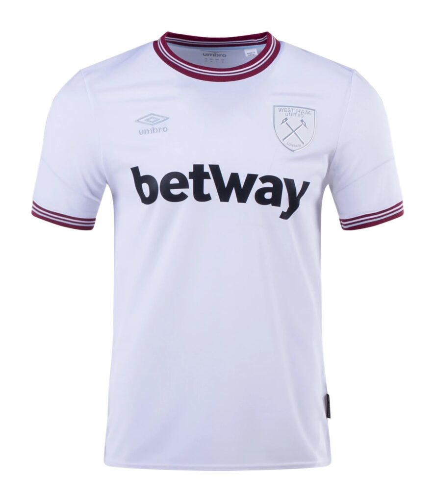
Best: West Ham United (Away)
A white-out approach to this Hammers’ away shirt is sublime. The club badge and Umbro logo blend in perfectly. The collar and sleeve ends add heritage to the shirt, reminiscent of Man City’s home shirt from the Premier League season prior. Minus points for the betway sponsor, unfortunately. Otherwise, this is a stunner.
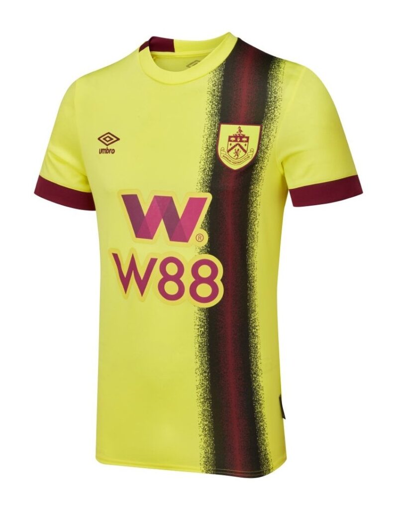
Worst: Burnley (Away)
The vertical sash looks as though somebody used this shirt to wipe their backside, which is probably a more suitable use for such an abomination of a kit. Even the base colour isn’t a million miles away from urine. Toilet humour? Yes. Deserved? Absolutely. It’s no wonder that the Lancashire side went straight back to the Championship, this season.
2024/25
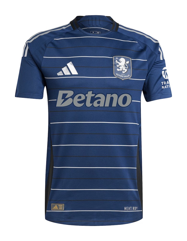
Best: Aston Villa (Third)
Cutting ties with Castore was probably the best thing Villa have done since fleecing Manchester City out of £100m for Jack Grealish. The horizontal, alternating pinstripes fall perfectly onto a beautifully clean navy base colour. Normally, betting sponsors are (rightfully) frowned upon but in this instance, the lightning bolt adds a little bit of extra flair to what is a very smart shirt.
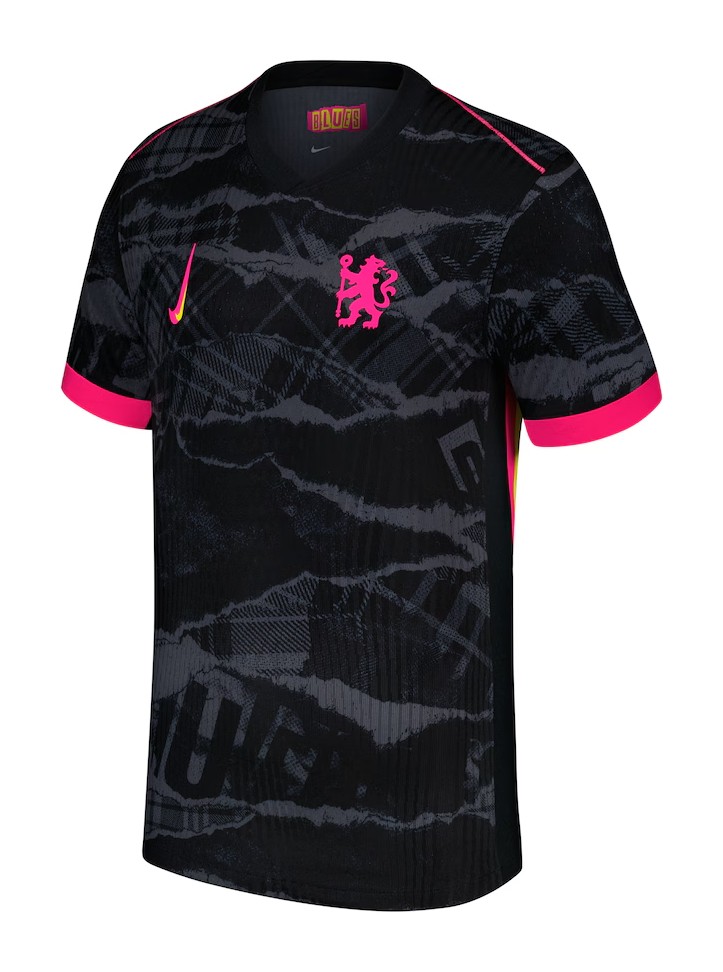
Worst: Chelsea (Third)
Ignoring the Sex Pistols influence, we simply cannot ‘never mind the bollocks’ that is the ridiculous wonky Nike logo. Sadly, a few third shirts from last season had to adopt the silly branding too. The pink and yellow accents are just bonkers too, it’s just “too creative” of an attempt at a third shirt which would be laughed out of Stamford Bridge if it weren’t for the (sort of) Chelsea badge.
You’re still here? It’s over! Go home. A happy, slightly belated birthday to Ferris Bueller’s Day Off. Joking aside, if you really have read this article in it’s entirety then thank you. Please let us know your thoughts on our choices via our social media platforms: @playstylesmag.