")
Sometimes, looking good isn’t everything. Just ask Dominic Calvert-Lewin.
The quality of a team’s shirt can sometimes seem to spur them on, and capture the identity of a memorable season through the style of their kit; see Barcelona 2008/2009, Croatia 2018 and Germany 1990. Occasionally, teams will outperform their football shirts, even lifting trophies despite looking decidedly silly doing so; see Germany 2008 and Chelsea in 2021.
But this list focuses on teams that had beautiful shirts, but were not so beautiful on the pitch. Seasons where kit designers had worked tirelessly to forge something creative and effective to represent a club’s whole identity, only for them to completely ruin this aesthetic through their performances.
So here are five football shirts that were let down by their teams:
5. Nigeria 2018 Home Shirt

This one might be a little bit harsh to include, as Nigeria hardly entered the 2018 World Cup with phenomenal expectations. They were plunged into a tough group, featuring one of the favourites in Argentina and a Croatia team who turned heads when they went all the way to the final.
It was a fairly strong Nigeria side, however, boasting Premier League talent such as Alex Iwobi, Ahmed Musa and Wilfried Ndidi. They opened their world cup campaign with a 2-0 loss to Croatia, but revived hopes of knockout qualification through a 2-0 win over Iceland and a Musa brace. Despite battling hard and equalising against Argentina via a Victor Moses penalty, Marcos Rojo’s late winner knocked the Super Eagles out, resulting in a third place finish. Whilst probably not a complete let down, Nigeria will have been disappointed to go home, especially with the incredible hype around this shirt, and some of the top flight players featured in their squad.
Designed as a ‘subtle homage to Nigeria’s ’94 shirt’, it features an eagle wing inspired black and white sleeve, and the mirrored pattern on the torso in green and white. This incredibly funky pattern led to the shirt selling out very quickly after three million pre-orders. The shirt symbolises the colourful culture of Nigeria through the creative pattern and bright green emphasis, and the placement of the player number offset to the side under the Nike badge looks vintage but classy.
A gorgeous shirt, that symbolised its country, but didn’t quite give the Nigerian players that extra edge on the pitch.
4. PSG 2021/2022 Away Shirt
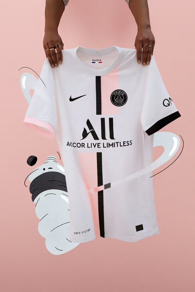
PSG are a pretty fashionable club. They’ve had many fashion based partnerships over the years, such as Dior and Blvck Paris, but most notably their Jordan sponsorship, which started in 2018. Since then, the French capital side have churned out some wonderful items with the Jordan logo, usually with eccentric designs on away and third football shirts. But in 2021, the Jordan logo was promoted to the Parisian’s home strip.
Though this did work wonderfully – that home kit itself probably could have made this list – it happened to be blown out of the water by this pink themed away shirt. The pattern featured on the shirt is simple but stylish, with the black centre line accented geometrically by the light pink. Even the fact that one sleeve has a pink trim and one has a black trim is a creative bit of detailing that most designers would fear may look unbalanced, but it instead adds character to the design. Another clever detail is the blackout PSG badge, which is perfectly dissected by the contrasting pink.
It helped the perception of this kit that it was to be worn by the most star-studded team in Europe at the time, with the new addition of Lionel Messi no less to accompany Kylian Mbappé and Neymar in a ridiculously talented front three on paper. ‘On paper’ being the key phrase however, as despite winning Ligue 1 (a formality for PSG most years), PSG underwhelmed yet again in the Champions League, especially given this squad. They qualified second in their group behind Manchester City, with draws against Club Brugge and Leipzig. They were then dumped out in the round of 16 by Real Madrid, halting their UCL expectations. Messi performed well for the blues but never looked as comfortable as he did for Barcelona and indeed Argentina, and the mighty front three never really gelled together.
Whilst Nigeria were a team that didn’t have much expectation and struggled accordingly, this era of PSG was a side that had the highest of expectations and never lived up to them, despite looking lovely doing so.
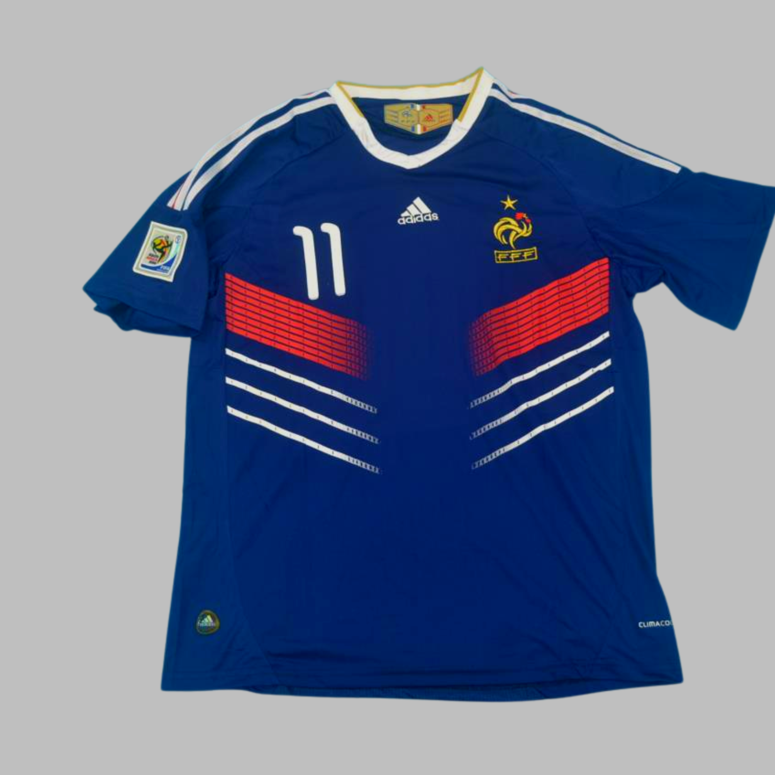
3. France 2010 Home Shirt
As already discussed with PSG, France is a stylish and eccentric country. This is reflected in their national team, who have had many great football kits over the years. Their 1998 strip was an incredibly smart retro look, and even recent shirts have impressed, such as the 2022 home shirt featuring gold accents on a more navy background. They have been pretty successful with these kits too, winning two World Cups and two European Championships in their time.
However, 2010 is a year that French fans will always want to forget. After a poor start to their world cup campaign with a draw against Uruguay and a loss to Mexico, striker Nicolas Anelka was sent home for insulting coach Raymond Domenech. Why? Well, at half-time with France drawing 0-0 to Mexico, Domenech criticised Anelka’s performance, specifically his positioning. So, Nicolas Anelka decided to respond by saying, although this is alleged: “Va te faire enculer, sale fils de pute” or, in English, “Go f*ck yourself, you dirty son of a b*tch”. This was leaked to the media, and was on the front cover of L’Équipe the next day. At that point, Anelka was sent home and France’s campaign was over.
But the turmoil wasn’t; many of the French players staged a boycott, refusing to train and issuing a statement of public defiance. The scandal led to the resignation of French Football Federation managing director Jean-Louis Valentin, who said he was ‘disgusted’, ‘sickened’ and ‘scandalised’ by the whole situation.
All this is a huge shame however, because France’s kit this year was absolutely fantastic. It featured a central Adidas logo – a centralised logo of any sort always helps a shirt look better – the royal looking gold France logo, and a lined pattern with a modern red gradient that gave the shirt a pop of extra colour and reflected the French flag. The font for the number, featured on the front like the Nigeria kit, and lettering on the back looked clean and contemporary, for a kit that felt ahead of its time whilst still nodding to retro French styling. A brilliant shirt, spoilt by a terrible footballing scandal.
2. Germany 2018 Away Shirt

I promise these won’t all be international football shirts, but there have been many national teams that have gone into tournaments with not only incredible footballing expectations, but incredible kits too, only for them to hugely underperform. Another great example of this is of course Germany in the 2018 World Cup, who had not one, but two great shirts. Their white and black home shirt was a modern take on slick designs from the 90s, but the one we’d like to focus on is this gorgeous turquoise away strip.
Adidas brought back the most recognisable Germany away kit colour, a turquoise green colour that is most associated with West Germany’s success in the 1990 World Cup, and shirts worn in the 50s and 60s. This modern update features this green, with darker coloured zig-zags featured in the background as a nod to patterns featured on historic Germany home and away strips. The shirt is obviously elevated by the gold world cup emblem in its dead centre after Germany won the competition in 2014, although any shirt would be. As is a common feature with international kits, the number features on the front, and does so in clean modern lettering which mirrors the player name on the back.
So how did the reigning World Cup champions playing in two brilliant shirts representative of their incredibly successful footballing history get on? They got knocked out in the group stage, finishing bottom. They lost to Mexico, then needed a last minute Toni Kroos worldy to scrape past Sweden, and then lost 2-0 to South Korea to secure their exit. What a waste.
Unfortunately, due to their performance many Germans will probably never wear this shirt, but had they done well in the competition, it would have gone down as a classic.
1. Manchester United 2021/22 Away

Manchester United were an easy side feature on this list, having a whole decade of pretty disastrous seasons to choose from since the departure of Sir Alex Ferguson. Their most recent campaign is probably the worst of the lot in terms of on the pitch performance, but whilst they do have some nice shirts this year, there have been better ones over the years. Going with United’s 2018/19 pink away kit was tempting and was a very unique shirt for the Reds, with them finishing 6th in the league and going trophyless.
However, I’ve gone with the away kit from the club’s 2021/22 campaign which was underwhelming both on the pitch and off it. It was such a promising start, with the huge hype around the return of Cristiano Ronaldo. Despite a decent start with a 5-1 win over Leeds United (which included Raphael Varane’s unveiling pre-match), and Ronaldo scoring on his debut against Newcastle, United tailed off, hard. Ole Gunnar Solskjaer was sacked following a 4-1 loss to Watford and the club sat in seventh in the league, and Ralph Rangnick took over on an interim basis. The club ended up finishing sixth, and with Rangnick famously saying the squad needed ‘open-heart surgery’ and cancelling his role as a board advisor that was set up for the following season.
The shirt however, is great. It’s a modern take on a piece of retro styling – an homage to the ‘snowflake’ jersey of 1990/92 – that uses all the greatness of the blue pattern but in a more contemporary manner. The slightly more orange tone to the red accents also contrasts the lighter blue nicely, and the white neckline and sleeves break up the detail of the styling in a simple way. The use of bright blue shorts also gave the kit a nice pop on the pitch; whether or not a shirt holds up on the pitch is always the mark of a great kit, and this one certainly does. Overall, it’s a creative shirt, that juxtaposes the lack of creativity its side had in games.